Pirx – a bean-shaped search bar design you’ll love

Sometimes “the best looking” feature just isn’t good enough for your shop. That’s why we’ve taken up the challenge and designed a brand new design of FiboSearch search bar. We want it to look the exact opposite to our straight and angular Solaris, our default bar – to give it a soft, curvy and rounded feel that blends smoothly into the front of the store. We called it Pirx.
The front page of your store is obviously the first thing your clients see when they visit. And the search bar is (in most cases) the pivotal point of your design. It’s often bold and visually distinctive from its surroundings. The main purpose is to grab the customers’ attention and pull them in naturally to search for products. However, the biggest players in e-commerce are not equivocal about the exact placement of the search bar nor its overall design.
We decided to take up the challenge and design a brand new style for FiboSearch search bar. We called it Pirx. We wanted to achieve a softer, more curvy look. We started out with the best of intentions to let you select the bar code-less, by simply picking the suitable one from a drop-down list. With the help of GIFs, we’ll show you the design and describe it thoroughly.
A quick comparison of our first design, Solaris (default), and Pirx:


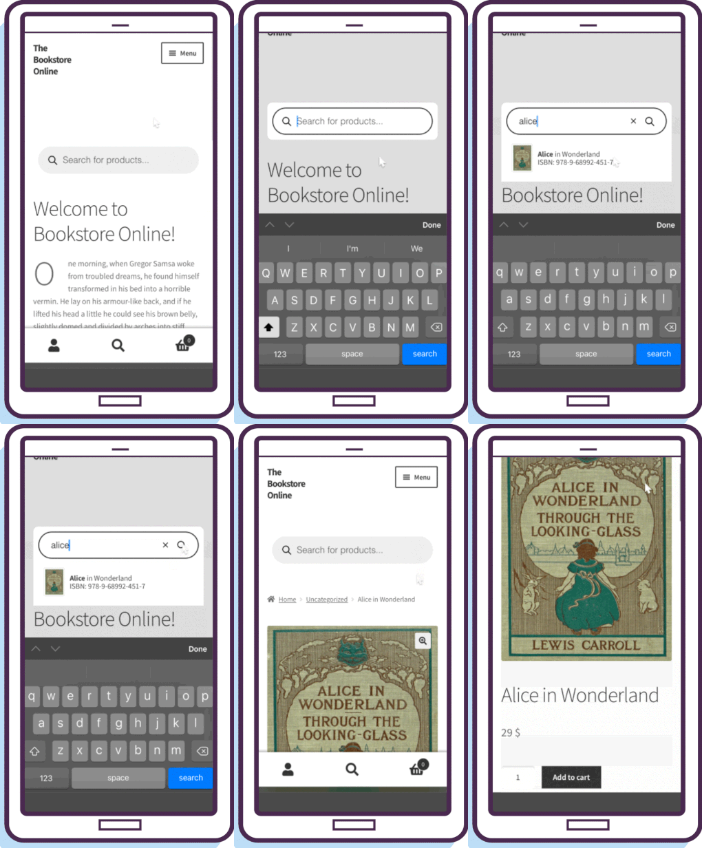
It’s worth noting here that Pirx works just as well on mobile devices as it does on desktops. The bean-shaped style nicely blends with your page and neatly corresponds to the mostly curved and smooth edges of today’s mobile devices. This style also resembles its desktop bigger counterpart – we’ll soon go into that in more detail in the article. Let’s take a look:

Table of Contents
Ok, let’s see how to get this done!
Selecting a style
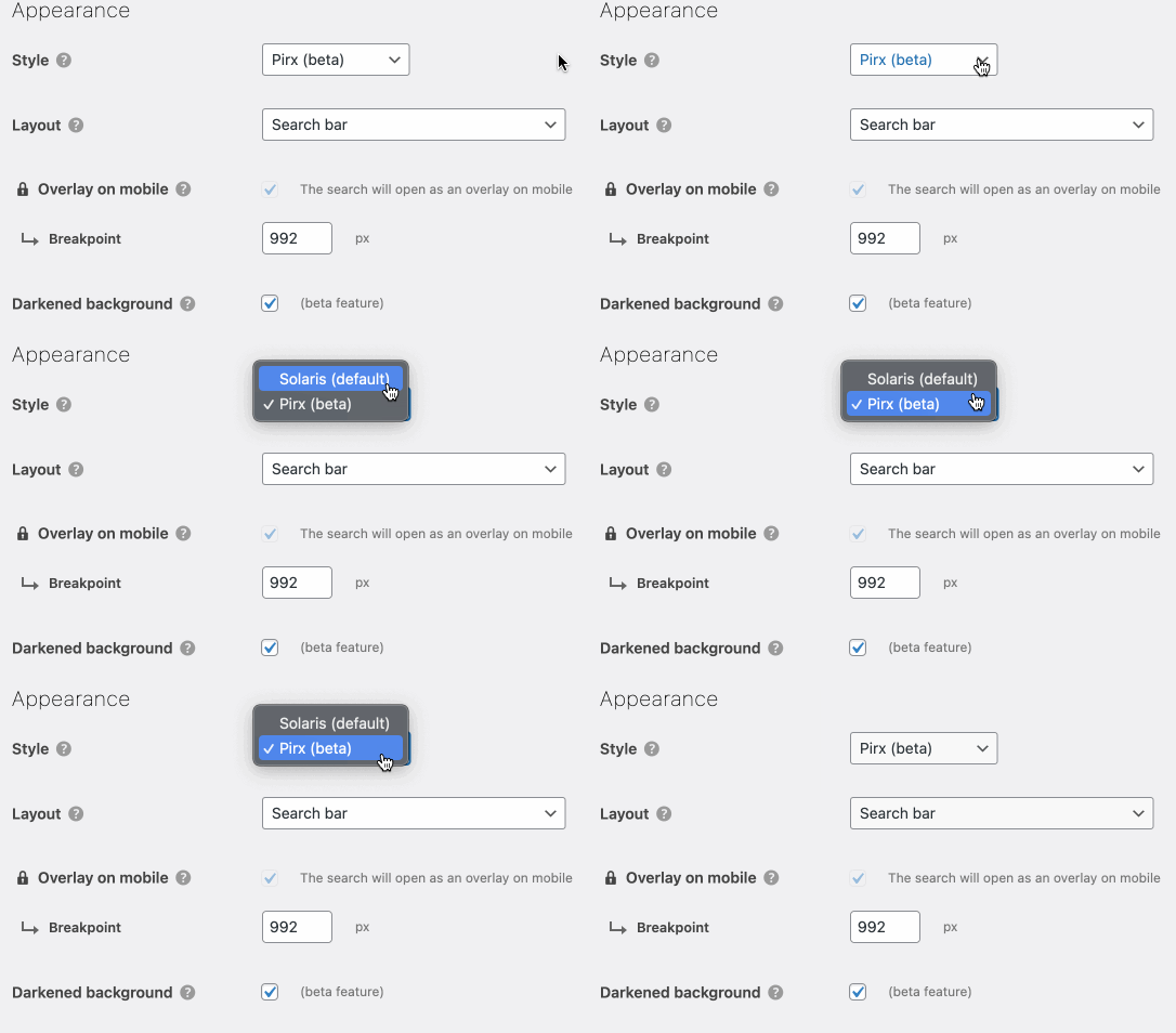
You can easily switch back and forth between both styles by picking the right one from a drop-down list. Please, from your dashboard go to WooCommerce → FiboSearch → Search bar tab → Appearance → select the style → save your settings at the bottom of the page

That’s it! Let’s see this on the front end:

Designer talk
All set and good! Now let’s see how this has changed the search bar design. Here is Solaris, the FiboSearch default, which we use in our internal testing shop, The Bookstore Online:

And here it’s the same store with Pirx:

As you can see, these two styles are really distinctive visually. First, we have Solaris, a slight variation of the most popular WooCommerce theme – Storefront. In our opinion, Solaris is much more streamlined and aesthetically pleasing. Moreover, we wanted to put function over form, as we find Storefront’s default too in-your-face and, obviously, with their brand’s go-to purplish color scheme. So, we aimed for a minimalistic and ready out-of-the-box style.
However, Pirx, the second one, is our first step towards more challenging and characteristic styles. We went for a bean-like shape, because it’s very often used across the web, and rightfully so. It’s also almost a perfect contrast to a rectangular shape offered by our Solaris style.
Moreover, the styles also differ in terms of how they behave once customers start typing their queries. Let’s have a look:

VS.

The main differences are:
- Upon hover, Pirx becomes distinguishably darker than Solaris
- When customers click on the search bar:
- Pirx’s immediate vicinity becomes a slightly rounded rectangle with solid white background
- Additionally, Pirx uses the Darkened background feature and darkens all of the bar’s box background – read about it in detail in our blog post
- The previously transparent border becomes a thin, solid black border, adding to the distinction between the search bar and its background
- Upon typing the very first character, the magnifier goes to the far right and switches from passive to a clickable submit button
- If three or more characters are typed, there is an “x” icon presented to the left of the magnifier – it is clickable and serves as a “clear all” button (however, the search bar is still active and allows customer to type another query; on such occasion, the magnifier returns to its default position, that is to the far left of the bar)
- Upon hitting the three-characters mark (or copy-pasting a longer phrase), autosuggestions are presented – within the same white box that separates Pirx from the darken background
- Customers can quit the search simply by clicking anywhere other than the search bar itself or the white container
Ok! We hope that you like this style and find it useful across your site.
Feedback
Great! We hope that you’re as excited as we are with our latest style. Please feel free to give it a try and share your thoughts – in the comments section or by contacting our amazing support team Fill in the contact form here! . Drop us a line if you find any bugs or functionalities that make this style hard to use – we’ll be very glad to find out about that and we’ll do our best to improve too!
Keep in mind that this is the very first in a series of designs that we’re crafting. We’ll be sharing more designs in the up-coming months of 2022, so please subscribe to our newsletter and follow news on this topic.
Kind regards
FiboSearch Team

10 comments
Hi I’m using the Solaris template for my search bar. I am wondering if there is a way using CSS to give the search bar a more rounded radius (similar to Pirx)?
Of course! Our support team is here to assist you – https://fibosearch.com/contact/
Hello there,
I really like Fibo Search and I would like only to know how to do one thing.
I have the Icon on main menu (perfect), when I click on it at the homepage I see the compact Pirx version, on other pages is displayed the Pirx version (not the compact one)
I would like to use the non compact Pirx, I see it is not enough changing the setup of the plugin at the backend
How may I fix it?
Of course I can put something in my functions.php file in the child them or some CSS code in custom wordpress code
Thanks in advance for your kind help
Hi there,
If you have selected not compact Pirx layout, you should see it everywere. I can’t recreate it on my end. Probably the issue is specific for your case. Can you create the ticket on our support or WordPress.org forum if you use FiboSearch Free?
Hi, is it possible to make Pirx work with different page backgrounds? At the moment rounder corner rectangular outer box is white, would be nice to have a option to change it transparent.
Hi Priit,
You can try to change it using CSS. My proposition to change the background to transparent is:
.dgwt-wcas-style-pirx .dgwt-wcas-sf-wrapp { background-color: transparent; }Hi team,
Any idea when the new version will not be ‘beta’ anymore?
Thanks in advance 🙂
Hi,
We’re going to remove a “beta” mark in the FiboSearch v1.21.0. Now Pirx is well tested and we haven’t found any crucial bugs so far.
I tried using this, i followed the the instructions the right away. I cant get the round corner search bar.
Hi Batsile,
We’ve added “Pirx” style to the FiboSearch core. Since FiboSearch
v1.19.0You can enable it with a few clicks. Go to WooCommerce → FiboSearch → Search bar (tab) → Appearance and select “Pirx” as the main style.You can also enable a bean-shaped search bar design using a shortcode:
[fibosearch style="pirx"]