Darkened background

It’s considered a best practice to add some visual distinction to the auto plate suggestions, according to UX gurus at Baymard Institute. Help your customers navigate your store — here’s how to dim the background and focus their attention on autosuggestions.
We want to address a really important visual component to the overall search bar UX: how to make autosuggestions pop-up from an often very crowded page? Some modern solutions are:
- Border
- Shadow
- Whole site overlay
- Pop-ups
- Darkening the background
An autosuggestions box that lacks some kind of smart visual distinction might be overlooked or annoy customers. Please compare these two examples, as they’re also covered by Baymard Long-read on Design Patterns for Autocomplete Suggestions experts:


A crowded design like in Figure A, coupled with no visual distinction for the autosuggestions, might result in a poor experience and the possibility that the potential customer might exit the store altogether.
We decided to take matters into our own hands and bring some of these features to FiboSearch’s search bar. The first to go is dimming the background. Let’s see this on an example:
The reason why this is the first of the possible innovations that we’ve decided to cover is that we incorporated it within “our latest search bar layout” Read a full article about how and why we made our newest layout — Pirx. The blog post that goes into this new layout in detail is to some extent complementary to this one. You might want to check out both of them!
The agenda:
Let’s go!
Why is a darkened background important?
To begin with, it’s worth considering why bringing in a darkened background feature is necessary when you’ve designed your store and search UX so that customers are offered autosuggestions, which they’ll want to find quickly and without any hassle. But then again, this is no easy task for today’s e-commerces. Assuming that you’ve also got some pop-ups, banners and other branding elements near and within your header, these features can easily overwhelm the autosuggestions. That’s why a visual distinction is crucial to drag customers’ attention exactly towards the search and autosuggestions box. Let’s see what Baymard’s pros have to say about this one more time:
“Darkening the page background while autocomplete is active gives it stronger emphasis, minimizing elements (e.g., ads, carousels, and other page content) that could distract users from considering autocomplete suggestions”.
Here’s a quick look at how things look with and without some darkening background implemented:

The benefits
It may probably be quite obvious at this point, but we want to pinpoint the immediate advantages of bringing in a darkened background:
- Customers can find autosuggestions easily
- Customers’ attention naturally navigates towards autosuggestions
- Opportunity to upsell or promote certain products – the darkened background can trigger a dropdown list even before customers start typing their queries, allowing you to present certain products, categories, offers etc.
- More chance to meet customer expectations, offer clean UX and avoid irritation
Our approach
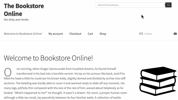
Moving on, we want to show you how we decided to gray out the background in FiboSearch Pro. We’ll use our mockup shop, The Bookstore Online, along with our default search bar layout. Here’s how it looks out-of-the-box:
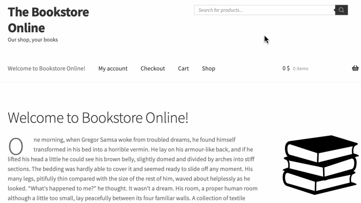
As you can see, there isn’t much going on after we’ve typed our query. A simple dropdown appears with some autosuggestions. However, irrespective of The Bookstore’s overall simplicity, it could still benefit from more distinct autosuggestions. That’s where a darkened background shines, although this metaphor is a little off, given how dim it actually is 😎
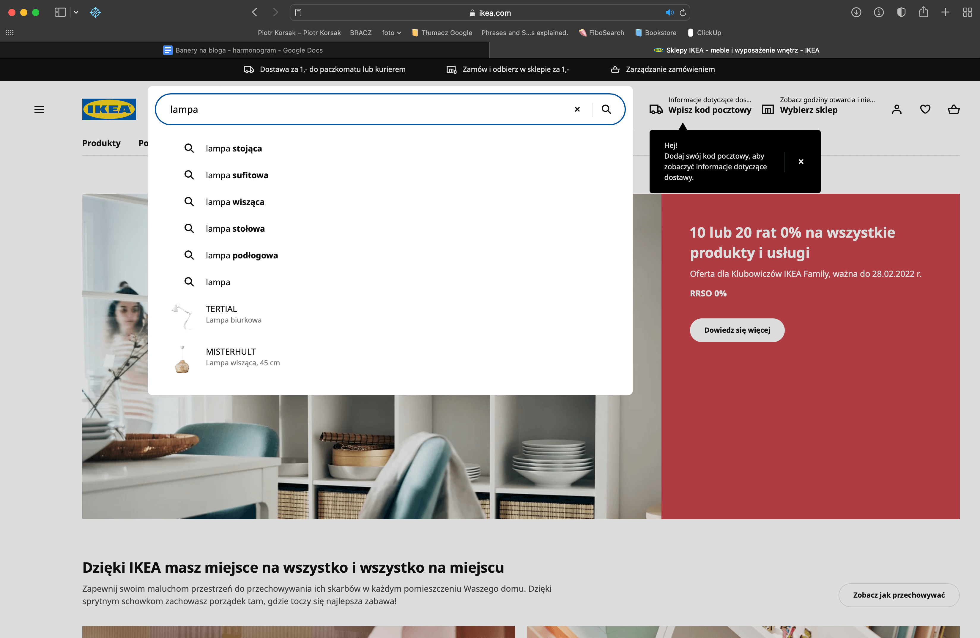
That’s more like it! Now the autosuggestions really stand out from the background, and are nicely contained in a single box alongside the search bar. Most importantly, they are easy to find and difficult to mistake with any other visual component of your store.
The implementation
This is the part where we want to show you just how easy it is to add a darkened background feature.
- Make sure that your version of FiboSearch Pro is at least
v1.17.0or higher - In the
FiboSearch dashboard→Search bar→Layout→Tick Darkened background checkbox
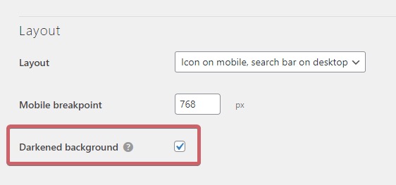
And — that’s it! A really simple implementation of a complex feature, just as you might have expected from the FiboSearch Team.
Feedback
Great! We hope that you’re hyped for a darkened background feature. Please feel free to try it and share your thoughts — in the comments section or by contacting our amazing support team. Please feel free to contact us if you find any bugs or functionalities that make this layout hard to use — we’ll be very glad to hear from you and we’ll do our best to improve, too!
As we’ve mentioned, this is the first feature that helps to make the search bar more distinctive. Once more, please also refer to our piece on Pirx, the latest search bar layout, to get more background information and see how a darkened background works on a different bar. We are going to gradually bring in some more functionalities and features in the following months of 2022, so please subscribe to our newsletter and follow news on this topic.
Kind regards
FiboSearch Team

8 comments
Hi,
the idea of the overlay is good the implementation not so good. Why adding 4 seperate divs that “encase” the searchform instead of just adding one div as overlay and put it with z-index behind the search bar and results? Your solution is super laggy when it comes to resizing the site. The script detects only when resizing is finished, therefore the “white” box is lagging behind and takes time until repositioned to the search bar and results. No need for all this complicated DOM to just have an overlay. Just add one div with position fixed and set set it to full height and width of the html document. No script needed for positioning also no lagging then.
Thx and regards
Hi Artan,
Thanks for your question. I knew people would ask about it. Let me explain why it is designed this way.
We can’t create a one div with a fixed position, because the search bar isn’t on the same level as search suggestions in the DOM. The search bar might be everywhere in the DOM so we had to place search suggestion div as a child of a
<body>element. Otherwise, the search suggestions were covered by other elements added by many themes or page builders. Absolute or fixed position didn’t worked and in a lot of cases the search suggestion were still covered. It was neverending story and we decided in 2019 to move search suggestion div into the top of the DOM – as dicert child of the<body>. It solved everything.If the search bar might be everywhere, and the search suggestions div has to be a direct child of the
<body>element, you can’t create a single div with a fixed position that covers the whole site besides search elements.So our solution using 4 separate divs allows us to provide a universal solution that always works. We would design it more simply if it weren’t the only way to cover 100k different websites.
We can take a look at your case and try to find a solution. Contact us for technical support, please. – https://fibosearch.com/contact/
Haha! Never mind! I see a gentleman asked the same question in Spanish.
I am all set and have implemented .dgwt-wcas-darkened-overlay
Thank you!
I am using the Pro version and I love this plugin! However, is there any way to make the site background a tad bit darker during the search?
If you have a CSS identifier I can work with that too!
¡Genial característica!
¿Cómo puedo modificar la opacidad por medio de CSS?
Default value of opacity is 0.15, but you can set your own value using the following CSS:
.dgwt-wcas-darkened-overlay {opacity: 0.5;
}
We appreciate. How can we customize the search bar and background darkness with CSS?
The simple search icon is preferred, but it overlaps the menu and the search field with CSS top margin. How to correct this with CSS?
We are forced to use the address bar in our theme menu but it’s too long.
Contact our technical support. We’ll try to solve it.