FiboSearch ❤ Elementor
 Max 12min read
 Elementor is the most popular builder for WordPress – period. And we, at FiboSearch, absolutely love to integrate with other amazing plugins. That is why we challenged ourselves to actually build something and share it with you. The effect is a minimalistic header with all the bells and whistles you might expect – and more!
Is Elementor the genuinely essential, virtually ubiquitous tool that its creators want us to see? Or is it just a bloated, over complicated and bulky site builder that no one either needs or should use? As always— the truth lies somewhere in between. But no matter your personal taste or our subjective opinion, what truly matters is how ever-present Elementor has become. Moreover, we know from our internal research that more than 30% of FiboSearch customers use it in their stores. The background of this tutorial is plain and simple: to show you that FiboSearch and Elementor work hand in glove.
The agenda:
- Basic Elementor workflow – what you should know to begin with
- We’re building a header! – using a typical Elementor header
- We’re building a pop-up! – using a typical Elementor Pop-up
- How to combine Header and Pop-up?
- It’s time to stylize
- Elementor templates
- Recap
One last disclaimer before we’re all good to go. In this article we’ll talk about a “pop-up”, “Pop-up” and “pop up” and we know that this might cause confusion. We’ll do our best to be as precise as possible. Here is what we understand by these terms:
- pop-up — a generic term used for every such item
- Pop-up (with capital letter) — a proprietary name for the same element, used in Elementor
- pop up — action of something appearing on the screen, in a rather hasty manner
To help you understand this confusing terminology better, we’ve found a great read What Is The Definition of Popup? on that topic.
Ok, as we’ve got plenty to cover, let’s jump right into it!
Basic Elementor workflow – what you should know to begin with
First of all, let’s talk about what Elementor definitely is. According to its creators, Elementor
“(…) is the leading website builder platform for professionals on WordPress; Elementor serves web professionals, including developers, designers and marketers, and boasts a new website created every 10 seconds on its platform”.
Its current active installation count is 5+ million users. Elementor offers both free and paid plans — for this article we’ll focus only on the paid, Pro plan. This is because we want to make use of stock elements (which Elementor calls Templates) and pop-ups. Both these features are only available in the Pro plan and we really encourage you to at least try it if you’re satisfied with the overall concept and workflow of Elementor’s free version.
Elementor allows you to build whole other WordPress sites or particular elements (hence its name) — most famously headers and footers. Another universally used feature is the ability to define global colors and fonts and easily manage it throughout the site.
As we’ve mentioned, we want to use and present you with two distinctive Elementor features. First we’ll build a header, using a predefined Elementor template. Every Pro user is granted access to the same set of designs, so you’ll be able to easily follow every step. Then, we’ll add a pop-up, one that resembles popular designs from any store online. Finally, we want to show you how to embed our FiboSearch custom shortcode within the created pop-up. We aim to create a minimalistic header with only three elements, so a bold and eye-catching search bar won’t fit. We decided to embed the FiboSearch search bar within the pop-up. That way the final design will be very sleek and clean, with a nice, animated pop-up sliding from the right side of the screen. From here all FiboSearch users will be able to search products and proceed with the ordering process.
Before we dive in deep and start building our Header, let’s talk about:
- Elementor overall layout and functionalities
- what Elementor brands as Dynamic Tags
Elementor overall layout and functionalities
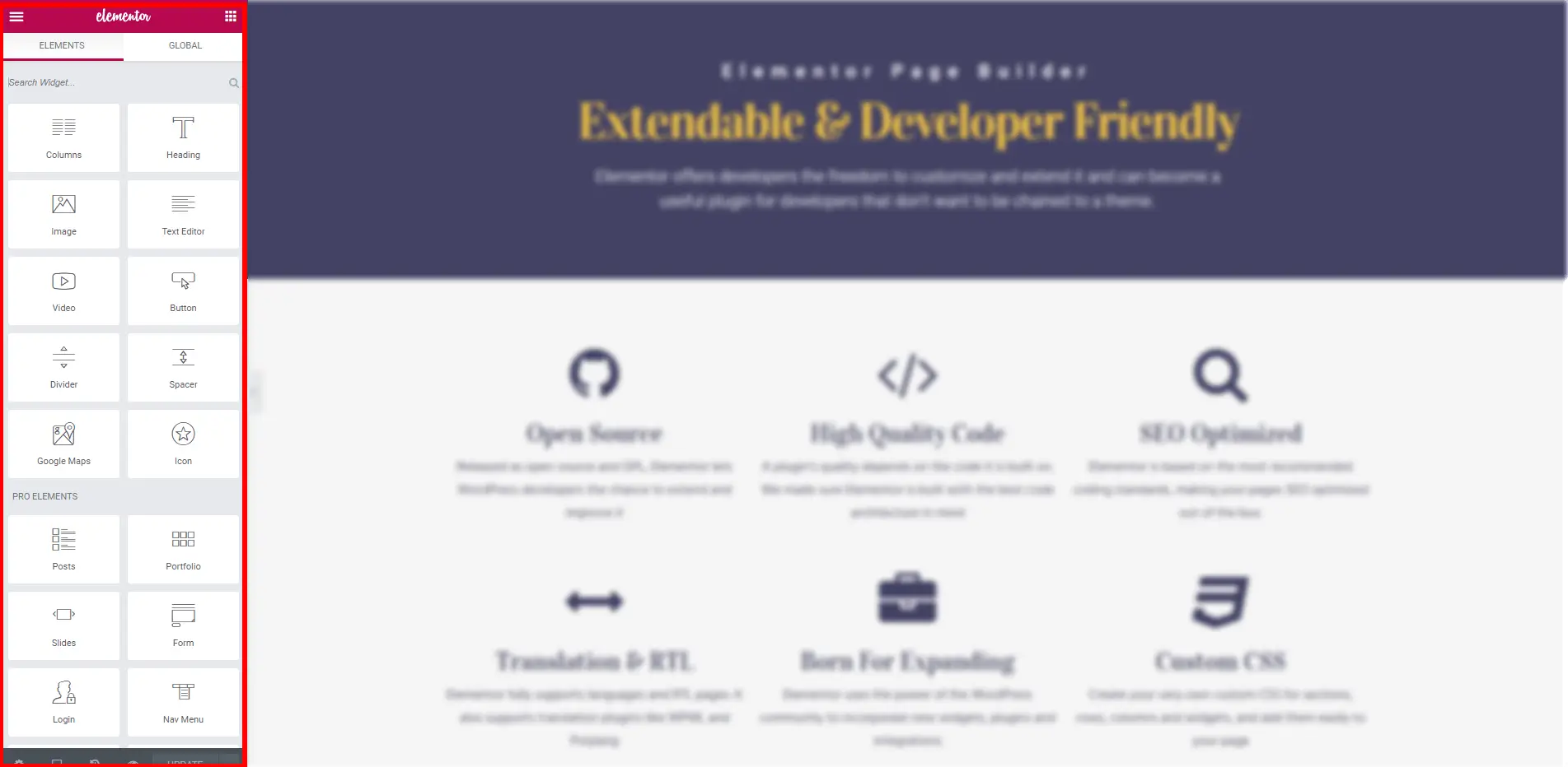
As we want this article to be as helpful, and educational, as possible we’d like to briefly describe the core Elementor panels and functionalities that you’ll encounter. What people most often describe as “Elementor’s” GUI, is what its developers named as Editor. It consists of two distinct groups, Panel and Preview.
In Elementor, both these elements are content-sensitive – it’s important to remember that some different functionalities change contextually when editing different content.
It’s especially important for editing content like static elements, e.g. Header or Footer, VS dynamic content like animated Pop-ups.
To dive deeper into Elementor workflow, please also refer to this article. There, Elementor developers share knowledge about unique features that make the whole webpage-building experience a breeze. Let’s only briefly describe all the features covered (all quotations from the documentation):
- Menu Panel – “the menu panel is the main panel in the editor”
- Site Settings Panel – “Site Settings is a panel in the editor where the user can globally define site settings”
- User Preferences Panel – “User Preferences is a panel in the editor where the user can control the editor’s look and feel”
- Page Settings Panel – “Page Settings is a panel in the editor where users can change the post/page fields such as, the title, the excerpt (if the post type supports excerpts), feature image, post status, etc.”
- History Panel – “History is a panel in the editor that allows users to see their latest actions and revisions”
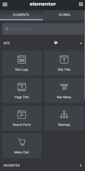
- Widget Panel – “Widgets is the gate panel (the first panel users see) in the editor”
Please pay close attention to those features, if you’re not already familiar with Elementor. It will really make your experience more pleasurable and streamlined for your goals.
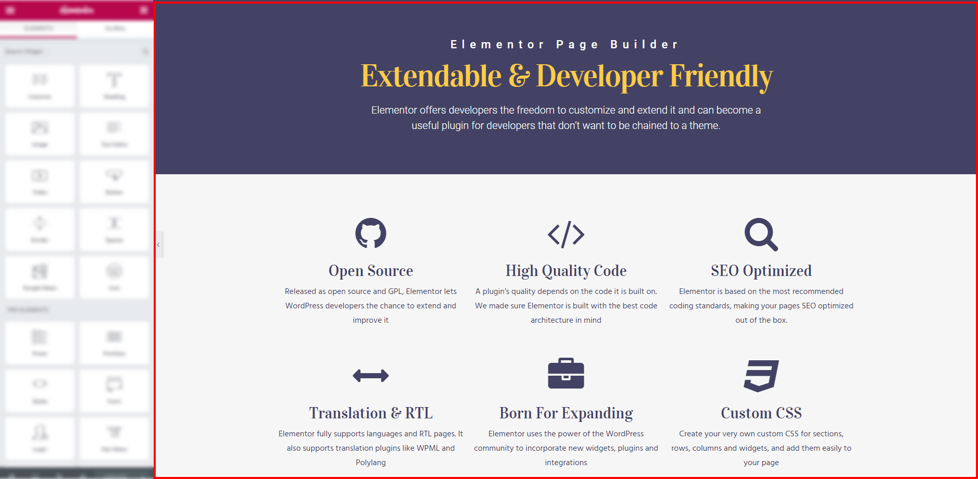
There are three really important final elements to the Panel side of the Editor.
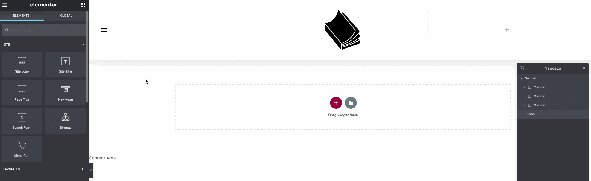
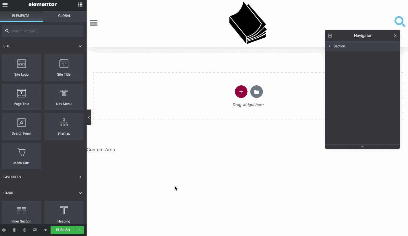
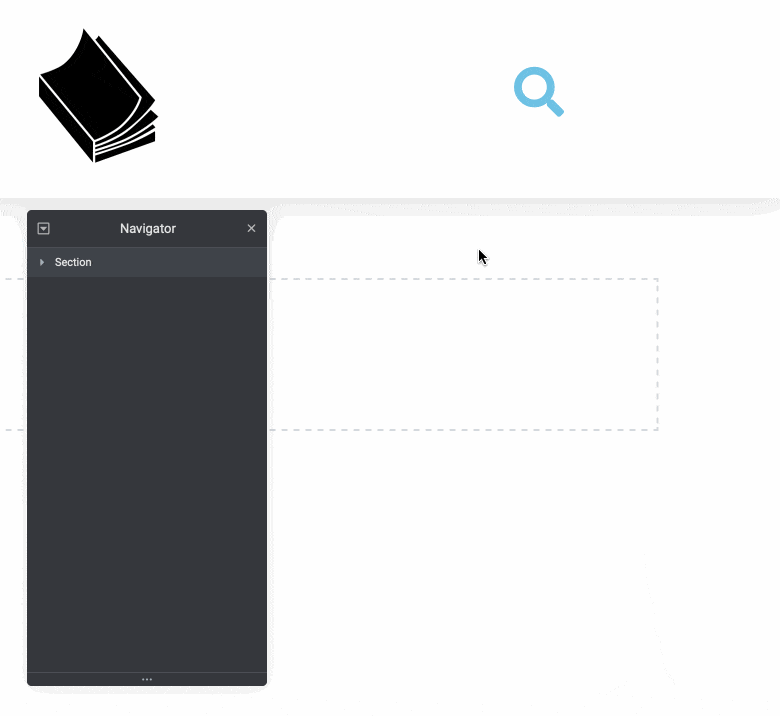
When you’re adding more and more complex elements to your Preview side of the Editor, there the Navigator comes in handy. This is
“(…)a navigation tree window that provides easy access to every element in the editor. It enables the user to drag elements throughout the page and edit them, quickly and easily”.
Here’s how it looks in action:
We’ll be using it throughout the article and we’ll remind you to use it as well.
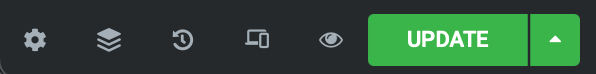
Second, once you’re done with your changes, ultimately you’ll want to save your settings and changes to present them to users.
In Elementor, this is called publishing and is hidden under a green – surprise, surprise – Publish button at the right corner of the Panel. Check out the GIF:
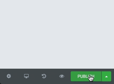
As you can also see on the GIF, once you’ve published an element, every next iteration of changes will be deemed to be an update – and the Publish button simply changes its name to Update. Quick and easy!
One last thing to mention here is that for our case we’re building a header and a pop-up and we want these elements to be present throughout the site. But as you might have imagined, there are obviously plenty of features or widgets that you want to be present just once (like a call-to-action pop-up) or only on a particular subpage (like a custom header or submenu). Is Elementor ready for that? Thankfully, the answer is a big YES!
This feature is called Conditions and is described at length on this page. Long story short, these two examples mentioned in the previous paragraph are easily customizable through Conditions and you can always revert to this feature to tweak them to your liking. Elementor developers also present it in a short movie, so please refer to it whenever in doubt:
To finish this section with a bang, we made a short go-to list for more detailed tutorials on specific Elementor features. Worry not, we’ll thoroughly explain every feature that we’re using within corresponding paragraphs. Consider this list a “further reading” or knowledge base for those of you who are more tech savvy or just want to plunge deeper into Elementor’s workflow:
- Short overview of front-end features
- A video on mastering Elementor’s workflow & enhanced design capabilities
- Ultimate (and nice!) Elementor tutorial by WP developers at GoWP
- More information about how to preview and publish your page
- Official Elementor page for developers
- Everything and more at Elementor Academy, for developers and designers alike
A word or two on Elementor’s dynamic tags
Moving on, we’ve deliberately left one crucial Elementor feature for a separate paragraph. We’ve done so to highlight it, as we’ll build our Pop-up later specifically around what Elementor calls Dynamic tags.
Let’s begin with Dynamic tags basics:
“Logo” is highlighted by clicking on it
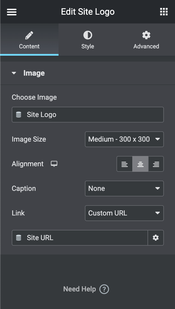
Within the box with Site logo information, there is a graphic element that you’ll encounter every time the Dynamic Tag is applicable – to us it looks like a stack of coins (see it above, in the table). Dynamic Tags allow you to recall predefined WordPress elements. In the above example, the Site Logo has to be defined prior, in the “Customize” section of your WordPress dashboard. Then, every time you want to display it on your page, you’ll use a Dynamic Tag. If you’re familiar with WP/Gutenberg Dynamic Content, you’ll feel right at home – Dynamic Tags are analogous in their behavior and workflow. Here’s an awesome tutorial to get you started!
Having said that, it’s worth noting that almost every Elementor widget is to some degree tag-able. Some functionalities, which are reminiscent of using Dynamic Tags, are:
- Post Custom Field
- Post Meta
- Post URL
- Author URL
- Comments URL
- etc.
However, for our purposes, there is a very unique type of Tag – one that can trigger Actions. Only a few widgets can be assigned to Actions, one of which are Icons. We’ll use this in our Header to trigger our custom-made pop-up.
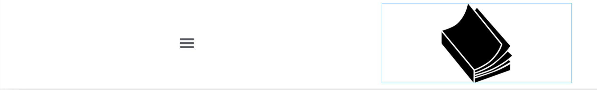
Below is a real-life example: we’ll build those elements and describe the whole process thoroughly. Right now, we want to offer you a glimpse of a typical use of “Action” Dynamic Tag:
This will launch a nice Action on the frontend, where our magnifier icon triggers a prebuilt pop-up:
This is a very common use of “Actions” Dynamic Tags, used especially in pop-ups and other animated areas of a webpage.
Great! For those of you who are still hungry for more, please refer to this site. We hope you’re starting to feel a little more knowledgeable about Dynamic Tags. One last thing to really get going. It might be totally confusing for novices how to actually exit Elementor’s Editor. Well, to go back to your WordPress dashboard, follow these steps:
Now we’re ready to really get down to building in Elementor!
We’re building a header! – using a typical Elementor header
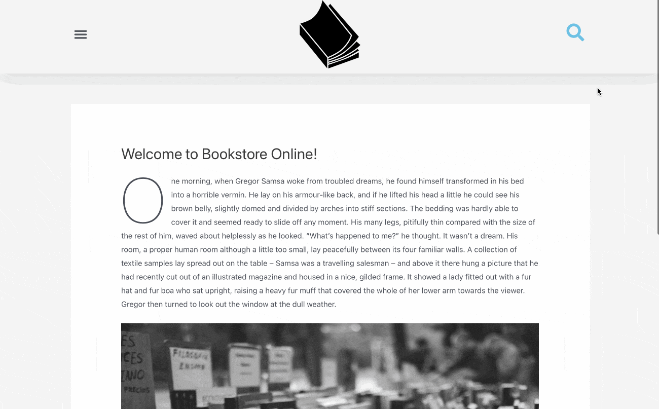
In this section, our goal is to build an Elementor Header. In most cases those headers are ultimately used throughout the entire site or store – including front page, shop, cart, etc. thus, it’s crucial to place only essential elements within and encourage customers to actually engage with them. For our purpose, we’ll build a safe and road-tested layout:
- Menu, to the left, behind a “hamburger”
- Your store’s logo in the center, which also serves as a backlink to the main page
- Search icon to the right
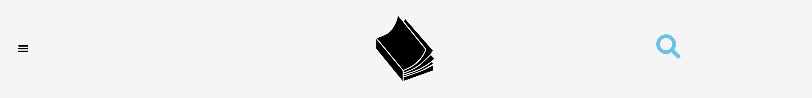
Here’s how the header will look like at the end of this tutorial:
First, we’ll build a header, then a pop-up, with as minimal styling as possible. The final visual touch will be described in this section, so please jump right there if you’ve already built an Elementor Header and/or Pop-up before and you only want to style yours similarly to ours. Please remember that you’ll also find a whole .json files with all necessary downloadables for this project in downloads section!
Ok, let the job begin.
- Download and install Elementor (from WP repo or your Dashboard) and Elementor Pro from your account; here’s how to connect and activate your licenses
- In the Dashboard, go to
Templates→add New–Type Header→name Header→Create template
- Elementor opens
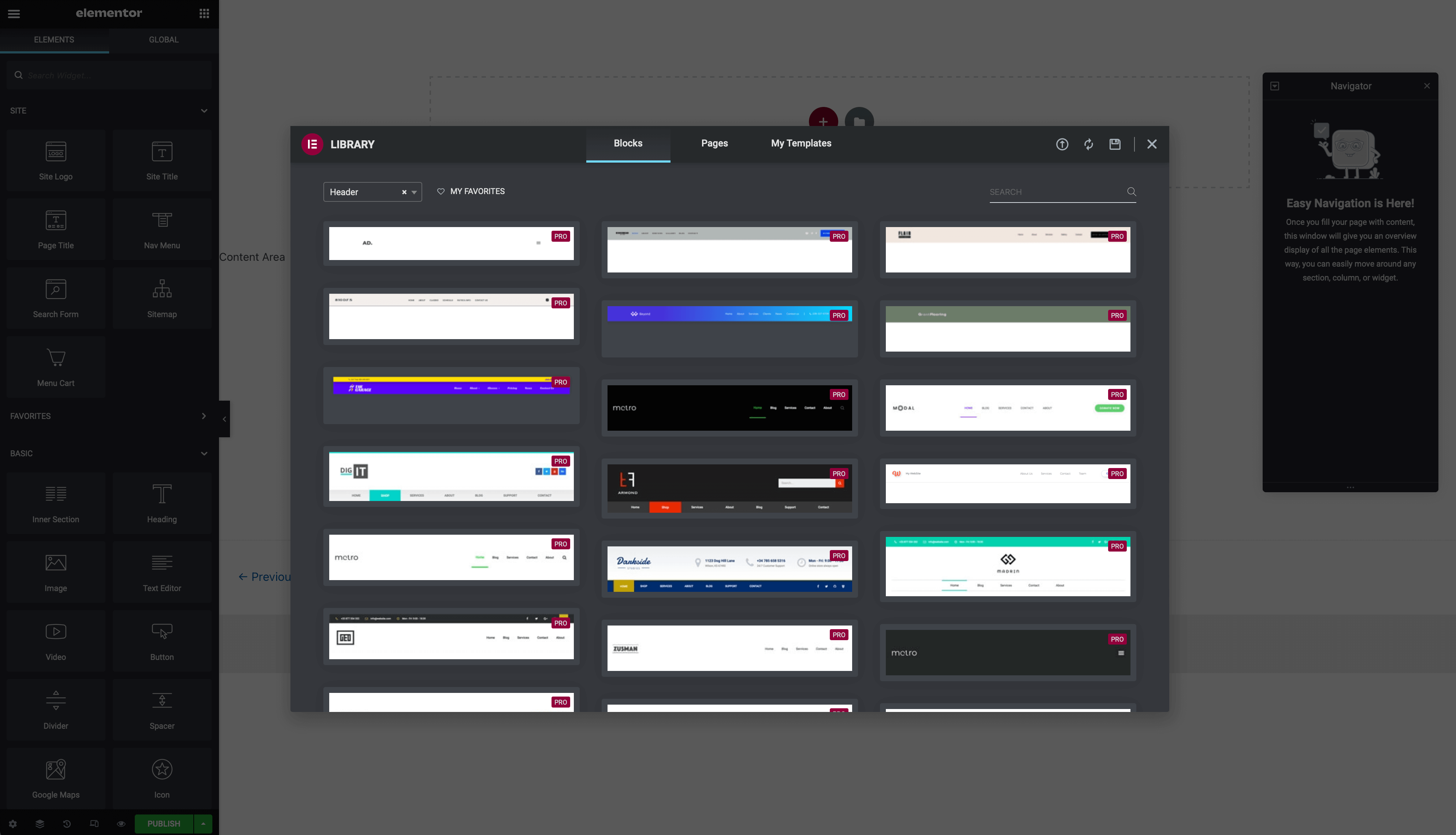
- Before moving on, please click Navigator to be visible – it’ll improve the workflow and clearly show you which element you’re working on
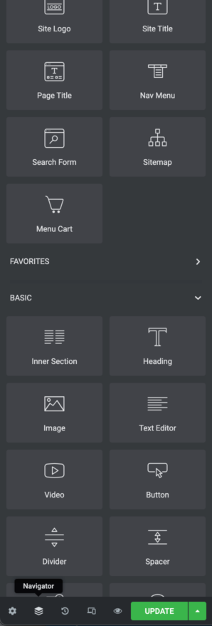
Pick a template to work on it– we chose this one because its layout corresponds with what we want to achieve: menu to the left, centered logo and an icon to the right →hit Insert
- After adding the template, please
select the whole Section from Navigator→in the Layout Box at Widget Settings select Content Width→Boxed→right under it Width→1024px– this will be our header’s fixed width

- Moving from left to right:
- Leave the Hamburger menu untouched
- Instead of Metro you’ll see your logo (again, Dynamic Tags are pretty awesome!)
- To the right side, especially the Icon we’ll make changes to the whole section
- From Navigator
select Section→pick last Column→select Search Form→right-click on it→Delete
- Instead,
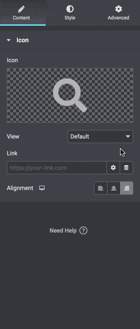
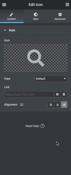
drag and drop a simple Icon block from Widget settings→place it within the same Column that we’ve just deleted Search form from
Pick an icon that suits your style– we opted for a classic magnifier – just click the default star icon in the Edit panel and change it to your liking
- All for now:
click Publish→define Conditions→for our case Add condition→Entire site→Save & Close(more on Conditions in previous chapter)
- Right after successfully adding the header you’ll be prompted to OPEN SITE EDITOR or VIEW LIVE SITE – it’s an easy way to edit and view your changes to the layout
Exit to WP
Let’s move to the next section and build a pop-up!
We’re building a pop-up! – using a typical Elementor Pop-up
As we mentioned in the introduction, we ultimately want to build two distinctive elements — a header and a pop-up. Then, we’ll merge them, in a way, and implement some creative stylistic features. Together, these two will end up looking and working seamlessly as if they had been built this way from the beginning. At this point it’s clear what the “header” is and how to bring it to life. But what do we mean by a “pop-up”? Let’s have a look at some real-world examples and try to figure out how to come up with the best possible pop-up designs.
Our main focus in these examples are header- and search bar-related designs and solutions.
This quick comparison led us to build a short list of the most common features appearing in pop-ups. We’ll use some of them in a minute:
- Overlay – the pop-up covers 100% of the screen; typically a combination of a solid background and smaller size rectangle with text and images is used
- Pop up – the pop-up bumps directly on the screen, as opposed to sliding; it may appear with an animation, most commonly a bump or a grow+shrink combination
- Slide – the pop-up slides swiftly or slowly from any side of the screen
- Darkened background – pop-up darkens its surroundings when it appears on the screen
- Corresponding style – the pop-up’s design often corresponds with the general page design in terms of layout, fonts and color scheme
- Additional or main menu – many stores purposefully hide menus or other core functionalities within pop-ups; it’s a great idea especially when the goal is a sleek and minimalistic layout
Now we’re ready to build our pop-up. As we’ve mentioned, some of these features will be used in our design alongside what we deem best practices.
- Once again, in dashboard,
go to Templates→add New – Pop-up→name “Pop-up”→Create template - Elementor opens
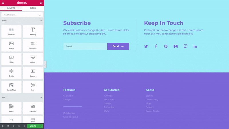
- You’ll be presented this view:
From the Elements panel→drag and drop the Shortcode widget
Copy-paste [fibosearch layout=“classic”]→hit Apply- Important note: this shortcode will bring in the default FiboSearch search bar layout called Solaris; please be aware that we also introduced a brand new layout in March 2022, Pirx; you can pick which one will appear after applying Shortcode: the dependence is set for all search bars throughout the site in
WooCommerce→FiboSearch→General settings
- Important note: this shortcode will bring in the default FiboSearch search bar layout called Solaris; please be aware that we also introduced a brand new layout in March 2022, Pirx; you can pick which one will appear after applying Shortcode: the dependence is set for all search bars throughout the site in
- As with all Elementor widgets, you can stylize them in the respective Edit panel – we’ll have a go in the next chapter; if you’re only interested in that, skip right ahead
- For now, let’s click Publish
- We have to define our Conditions
- In our case let’s just add the same Conditions as we chose with the header:
Add condition→Entire site→Save & close Exit to WP dashboard
That’s it! Let’s move on to the next part and merge our two elements into one.
How to combine Header and Pop-up?
As of now, we’ve built an Elementor headerand a pop-up. It’s high time to make them work together.
Of course, both elements work well as standalone features. However, the sheer power is revealed when we achieve a form similar to our finished designs. Let’s set this as our goal and reminder right away:
Let’s merge our prepared elements.
Remember the introductory section on Dynamic Tags? This is where we’re going to make the best use of them. As we said before, Dynamic Tags act as triggers for other Elementor (and, more generally, WordPress) widgets. In our case we want our pop-up to, well – pop up! Moreover, we want this action to be triggered by clicking on the magnifier icon in the header.
To begin with, let’s have one more look at the last set of images above. The first two present the current state of affairs. We have our elements built and ready to use, but now they occupy rather distant areas. To put them to work together, follow these steps:
- From WordPress dashboard,
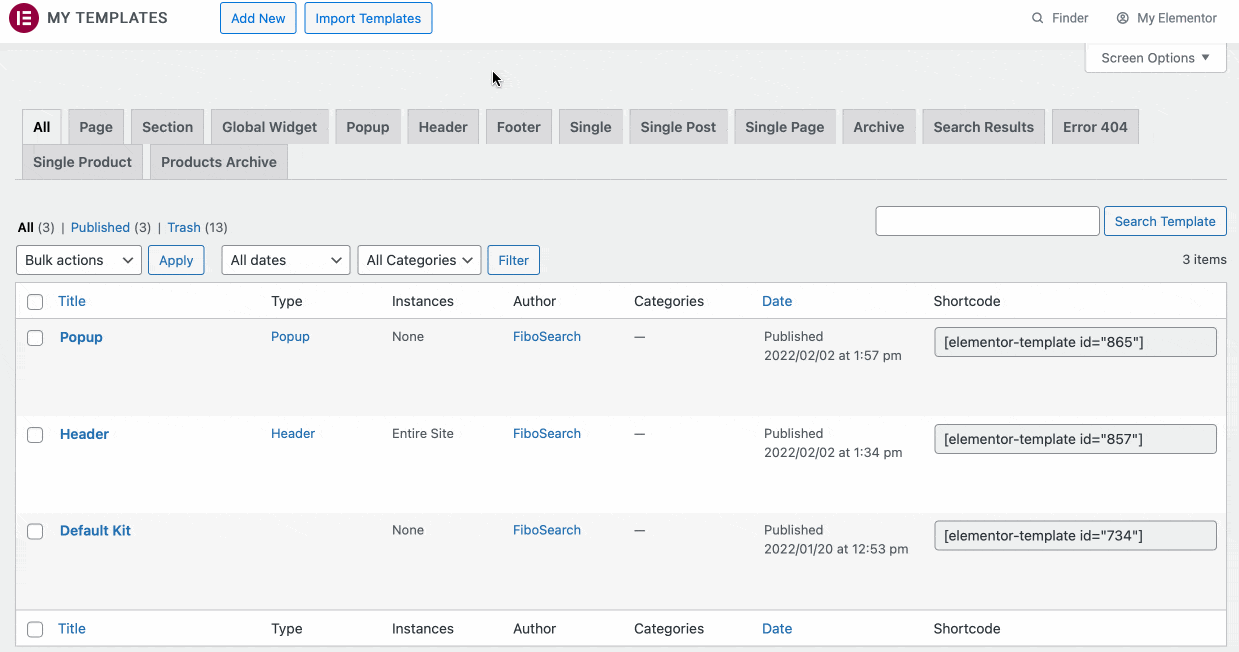
navigate to Elementor→Templates→Saved templates(you might need to click All to see all saved templates)
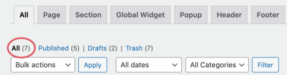
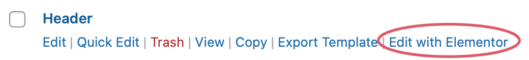
Find your saved Header template→hit Edit with Elementor
- Elementor opens
- Once again, remember to open Navigator if you haven’t already done so or it was closed by accident
Left-click exactly on the magnifier icon in your header– that’s where Navigator comes in handy as it helps you to make sure which block is selected
- From the Edit panel
select a Dynamic Tag iconFrom the dropdown list select Popup- In the next step you can select any of your previously created pop-ups
Start typing the first characters of your pop-up’s name and select the right one– in our case it’s simply Popup (in the search box seen as “Popup (Template)”, because we’ve made it)
- Save your settings by clicking Update at the bottom of the screen (notice how this time the Publish button has already changed to Update)
Hey presto! Now every time someone clicks on your magnifier icon, a pop-up will pop up (remember when we mentioned the confusing terminology throughout this article, right?). Now, let’s sprinkle some Elementor magic on our design — it’s time for some style!
It’s time to stylize
Right now our layout and pop-up behavior are bare Elementor defaults. Let’s see the header/pop-up combination in action:

As you can see, stylistically it’s more in the kind-of-ok zone, at best. We want our layout to be more eye-pleasing and aesthetically complementary to the whole page. To do so, we’ll:
- Make adjustments to the header, especially the logo sizing, columns alignment, width, etc.
- Choose the icon’s size, color and orientation
- Fine tune the padding and margins within the header
- Make our pop-up slide from the right side of the screen on entrance as well as on exit
- The pop-up will overlay the whole right part of the screen to the width of the search bar (730px), with a clean and minimalistic white background
- The pop-up will additionally darken the rest of the page
Stylizing the header
Let’s start with our header:
- From WordPress dashboard,
navigate to Elementor→Templates→Saved templates Find your saved header template→hit Edit with Elementor- Elementor opens
- To stylize consecutive widgets, we’re going to use all three tabs from Elementor’s Edit panel:
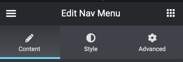
- Content – here you can adjust content width, height, alignment, etc.
- Style – all typical stylistic adjustments that otherwise you’ll have to do using CSS: background colors, fonts, background overlays settings; most settings you can set both for “active” and “hover” state
- Advanced – here you can set padding and margins for a certain block, as well as animation, responsive settings; this is the area where you can add custom CSS and add values to your block – as Elementor’s Custom attributes or typical CSS Classes/ID’s
- Moving on, let’s see how our header looks now:
- First, we want to set up the maximum width of the bar, accordingly to our site’s width; from the dropdown
select Content Width→Boxed→Set it to 1024px
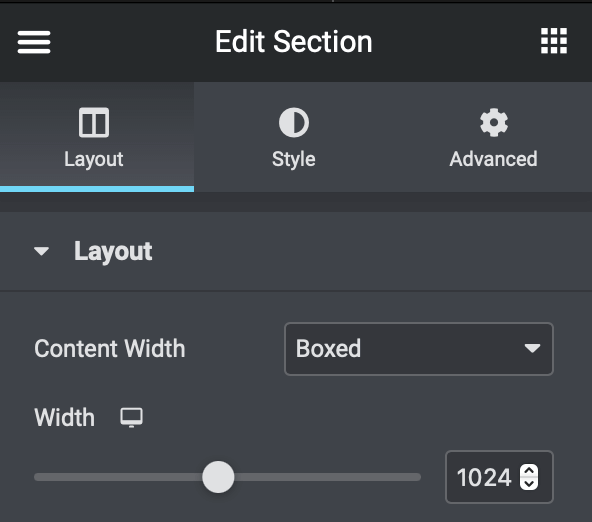
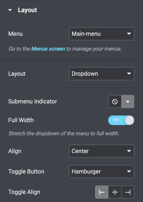
Move to the Advanced tab and reset all padding and margins to 0– that way we’ll have a nice, short header corresponding to our logo’s height- Then,
select the hamburger menu icon– Nav menu widget in Elementor’s nomenclature - We want our main menu to be present here, so
select Main menu from the dropdown(or other name, if you named your menu otherwise) - Set the rest of the settings according to the picture
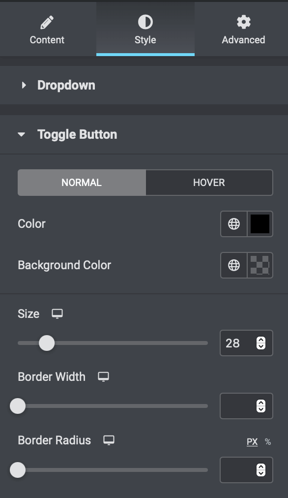
- To finally stylize the menu,
let’s move to the Style tab - We’ll leave everything with the default settings, except for the actual size of the hamburger:
move to Toggle button tab beneath→Size→28
- We don’t want to tweak anything more – the closing “X” button, highlighting colors and everything else we’re leaving as they are
- Now let’s stylize our magnifier icon
Click on it→In Edit panel set the alignment to “right” and leave the rest to the default settings
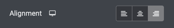
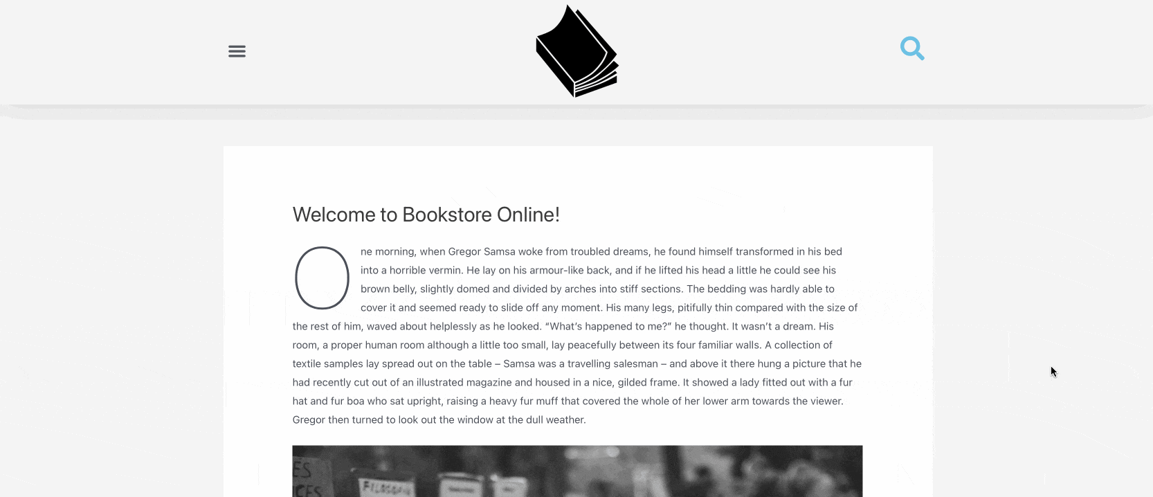
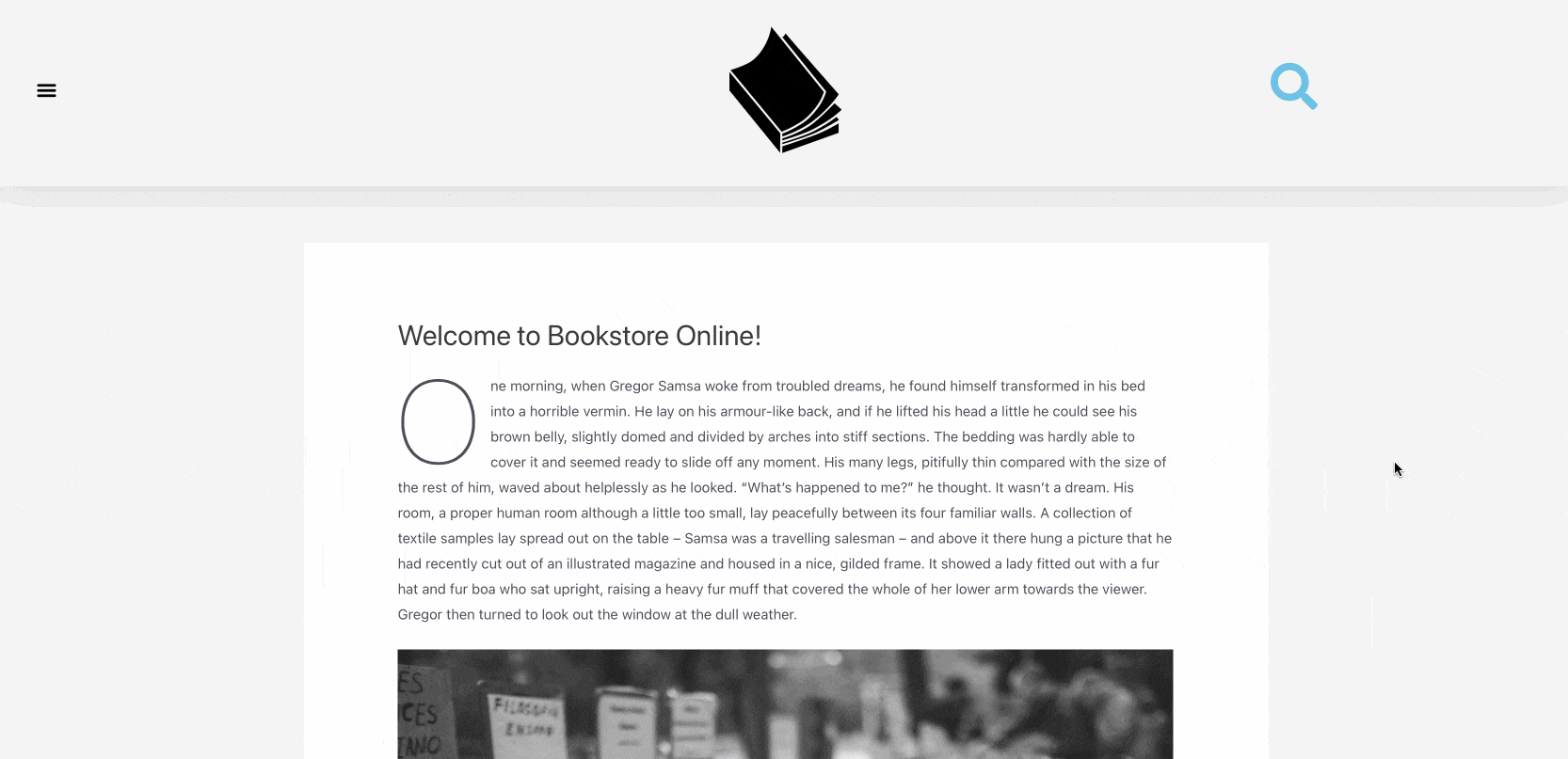
Move to the Style tab→Set the primary color to whatever you like. We chose “#6EC1E4” – a bluish tint that nicely corresponds to the rather monochromatic design of The Bookstore Online (this is our go-to mockup store to give you an idea of FiboSearch functionalities and creating print screens and GIFs that you’ll encounter on our blog)Set size (meaning “icon size”) to 35Click Update
And that’s it! Now we’ve got our header up and running, and looking good, too.
Stylizing the pop-up
Now, let’s move on to the pop-up:
- From WordPress dashboard,
navigate to Elementor→Templates→Saved templates Find your saved pop-up template and hit Edit with Elementor- Elementor opens
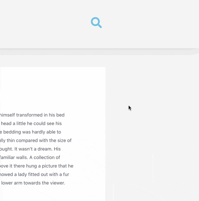
- What you can see now is our search bar floating in the center and the middle of the screen, with FiboSearch layout inside due to the use of the Shortcode widget (look up the “We’re building a pop-up section” for more info on that)
- We want our pop-up to slide-in from the right edge on the screen, overlay the whole right edge and darken the rest of the page
Please once again refer to this GIF, which shows the whole pop-up ready to go:
- Unfortunately, right now our pop-up looks like this:
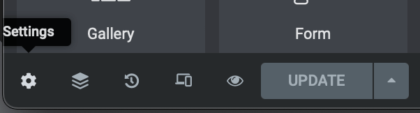
Pick Settings in the left-corner of the screen, according to what we described in the first section of this article
We’ll only describe the changes we made, consider everything else as left in default settings:
- In the Settings panel
- Width: 730px
- Height: Fit to screen – this will give us the full-height look that we’re looking for
- Position → Horizontal: Right
- Entrance animation: Slide in right
- Exit animation: Slide out right
- Animation time: 1 sec
- In the Style panel
Popup→Box shadow- Color: rgba(0, 0, 0, 0.2)
- Horizontal: 2
- Vertical: 8
- Blur: 23
- Spread3
- Position: Outline
Close button→Color→#6EC1E4- Vertical position: 10
- Horizontal position: 10
- Size: 24
And that’s it! One last look at our final design:
Elementor templates
We promised to give you ready-to-use .json files to import to your site – and here they are! Fortunately, Elementor makes it really simple to import and test different templates on the fly.
One last time, please open your WordPress dashboard → go to Templates → click Import Templates → Select a file → Import now
Recap
Phew! That was quite a ride. To recapitulate every section will be almost impossible, so we’ll stick to what we’ve achieved and what we think were the most important points we tried to deliver:
- Elementor’s workflow basics – core functionalities, how to Publish, add Conditions, which section of the Editor is named Panel and Preview; getting to know these terms and Elementor workflow will help us to help you, be it in the next Elementor-related article or if you’ll need to contact our support
- Dynamic tags and how they are essential for any advanced Elementor user
- How to:
- build templates
- use prebuilt Elementor templates
- build your first Header
- publish and set Conditions for any Elementor template
- build a Pop-up
- put templates together and get them to work properly
- stylize widgets and templates
We hope that you’ve enjoyed reading this tutorial and were able to build with Elementor with ease. As always, feel free to contact us and don’t hesitate to reach out to our support team if you encounter any problems with FiboSearch/Elementor integration.
Kind regards,
FiboSearch Team

2 comments
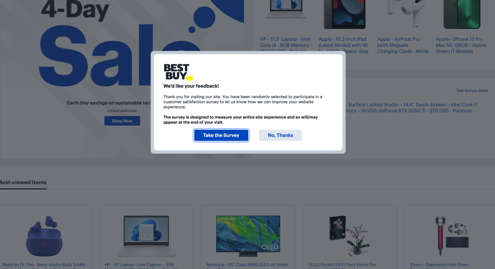
In the pop up mobile version, Fibo Search doesn’t respond to me. any possible solution? something that may be affecting?
Hi Emmanuel, it’s best to contact our technical support team. We’ll take a closer look at this.