FiboSearch and WordPress Block Editor

For many of you who started using WordPress with v5.0 (or: after 2018), the Block Editor (also called Gutenberg) is the WordPress editor. However, WordPress first hit the market in 2003 and, although it may be hard to believe, users had to use a completely different tool set to add content to their sites. We want to show you how content is added nowadays, the difference between the Block Editor and the newly introduced Full Site Editing and how to use it to your advantage. More so, we’ll present and thoroughly explain how to use our own, custom-built blocks. They allow you to add a FiboSearch search bar conveniently wherever you need it. Making the most of both the BE and FSE, it’s yet another small block to help you help your clients – no pun intended.
Table of Contents
- Introduction to WordPress Block Editor (BE)
- What is Full Site Editing (FSE) in WordPress?
- FiboSearch approach
- Recap
Introduction to WordPress Block Editor (BE)
In ancient times, namely: 2003, WordPress hit the market. It may be hard to believe, but back then simply adding content was a much more complex process. It was also back then that the foundations for a default WordPress editor were laid – the Classic Editor was born A fascinating study of the evolution of WordPress user interface. . Jump forward to 2018 and people are still using it. Of course, it was much more sophisticated and UX friendly, but the mechanics date back to the WordPress beginnings. However, a brand new tool has been looming large – the Block Editor (we’ll abbreviate it later as “BE”). This might be all very familiar to most of you. If you’ve been around WordPress editing since 2018, it might well be that you’ve been mostly using the BE.
Of course, even the Classic Editor was a deal breaker when it was introduced. Using an editor like this was more comfortable and fool-proof than coding any given element on your site. However, it came with its own limitations:
- It was easy enough for more tech savvy users, but not for a typical store owner, designer, blogger
- It was abstract, meaning to actually “see” and approve changes, users had to constantly switch between frontend and backend
- The layout and design were quickly outdated
- The UX was disappointing
With the adoption of the BE, WordPress team wanted to bring in some long awaited changes, content creation-wise. From now on, users were given much more freedom when they wanted to add any content to their posts or sites.
It’s worth mentioning that all modern themes fully support the use of the BE. Some offer custom, theme-specific blocks to attract users, while others solely depend on WP default block set. The standard, pre-installed themes like Twenty-Twenty Two, also fully support BE.
Using Block Editor along WooCommerce
From any store owner’s point of view all of this block shenanigans will be totally useless if WooCommerce doesn’t support the BE. Luckily, both tools are fully compatible and you can use the BE to put WooCommerce to work!
Automattic, the developers behind WooCommerce, have done an amazing job and offered a set of blocks to suit the needs of any store owner.
Let’s say that you want to show some specific, hand selected product in a blog post. From your dashboard, open and “edit” the post → select the place where you want to add the block → select the “Hand-picked products” block → select the products you want to present
Here’s a take from our mockup shop, The Bookstore Online:

Of course, there are many more WooCommerce blocks available. The full list can be found under this link.
What is Full Site Editing (FSE) in WordPress?
Similarly to the transition from the Classic Editor to the Block Editor, it was only a matter of time before the BE would be the ultimate web site building tool for WordPress. People behind WP are clever beasts and they know that most users struggle with coding and much prefer visually-oriented solutions. Suffice to say the popularity of tools like Elementor or combo themes like Divi or Beaver really skyrocketed in the last few years. For many users, designers and store owners this kind of interaction is in fact the default. Unfortunately, up to this point WP didn’t offer any similar solution. With the BE you still had to switch back and forth between front- and backend to see your changes and eventually approve them. This was a major drawback – visual builders simply allowed you to work more efficiently, faster. Finally, with WordPress 5.8, released in July 2021, the WP team introduced a fresh, proper visual tool. Enter Full Site Editing (FSE in short). For more technical information, head to the official documentation
BE vs FSE
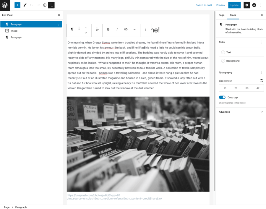
But what does this mean in practice? For those of you who are familiar with Elementor or other mentioned tools, the transition will be relatively straightforward. Let’s see this with an example:
VS
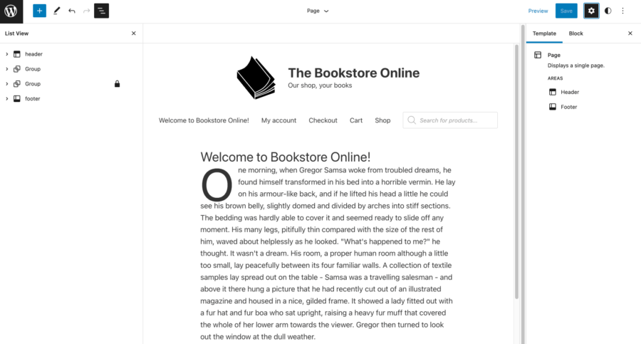
There are few key benefits to using an editor that is native to WordPress.
- First, you don’t have to switch views to see your changes. Everything is totally visible at almost any given time.
- You can create your own, reusable page templates (and assets within templates, too). Let’s assume you want every page on site to contain a header and a footer. Now, thanks to FSE, you can create such a “Single page” template without coding and apply it to all existing and yet to be made pages.

- Ultimately, the FSE is a transition from block-based editing content inside templates to block-based building and creating templates. Up until now, you were able to use blocks to make changes to posts or pages, but their overall templates were theme-specific or you had to create your own templates, coding and adding specific files to your theme. The FSE brought long awaited change and improvement.
Using FSE along WooCommerce
With the FSE, the familiar, block-based workflow, goes one step further. Now not only the content, but the design of the whole template can be created using blocks. It might be the case for your store to present hand-picked products on every page. Let’s try to add the “Hand-picked selected” WooCommerce block to the template:

From the dashboard go to Editor → select the place where you want to add the block – in our case just below the header → add the block → save your changes
Voila! As you can see, WooCommerce is well integrated into the FSE workflow and it’s certain that this integration will become ever more prevalent with every WordPress and WooCommerce update.
Important notice: on Figure 1 we’ve used the well-known Twenty-Twenty-Two theme to achieve a clean, minimalistic look of The Bookstore Online along WooCommerce
FiboSearch approach
Here’s how the “FiboSearch” block looks inside both the Block Editor and Full Site Editing. It’s a plain FiboSearch icon with the name that appears on hover.

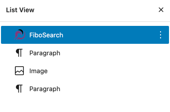
Of course, you can also add the block using its name, just type “/” and start typing “FiboSearch” – the block will appear in the popup and you can simply apply it.
To present you the full potential of our block, we decided to add it to the header of a page. We’ll show it in separate examples for both the BE and FSE, respectively.
Block Editor
Using blocks around a typical theme will most typically involve adding content to created posts and pages. However, this isn’t the only way to use blocks. We want to show you how to add our custom FiboSearch block to an existing header of one of the most popular themes, Astra.
Adding blocks to such a theme exclusively relies on the implementation of WordPress “Widget” block. More information about the Widget block in official WP documentation Moreover, the theme’s authors had to design specific areas to be suitable to use the ‘Widget’ block – for example, if you want to put them into header or footer. Sometimes authors only allow using the “Widget” block inside other elements, most typically sidebars or “below”/”over” header or footer.
We’ve decided to use the Astra theme with its in-built visual builder to present two consecutive and similar header designs in both BE and FSE. The rules described above will apply for many themes which include some kind of internal editor. Of course, there are other methods to embed a search bar on your site. For your convenience we described different methods of adding the FiboSearch search bar in our documentation (this list is frequently updated).

All of the tools that you’ll need are accessed through the “Customize” tab either from your dashboard → appearance → the theme’s specific panel or by visiting the frontend of your store → in the top panel choosing “Customize”
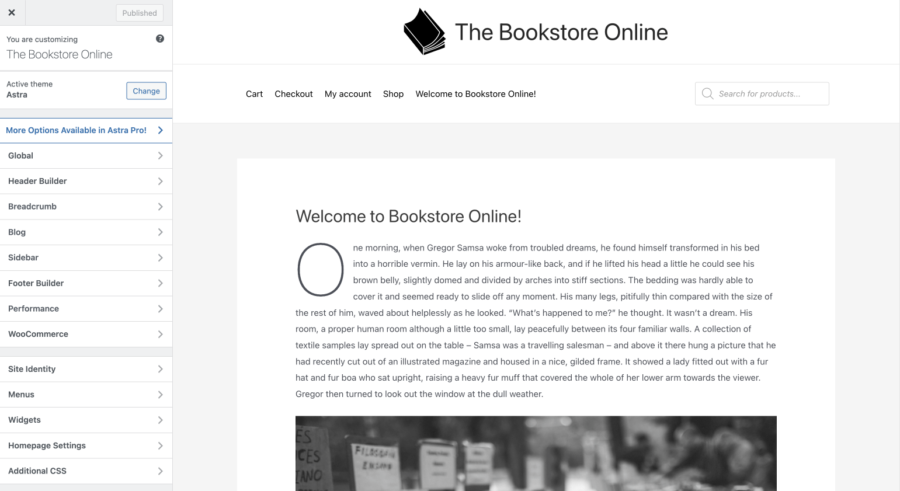
Once there, you have to go to the “Header builder” tab. The panel presented below will appear at the bottom of the screen:

To add specific blocks to a theme in “Customization” mode, you have to actually call them by a widget. In Astra, just select the space on the header builder → add the “Widget” element → inside the widget add the FiboSearch block, just as you’d do with any other block elsewhere
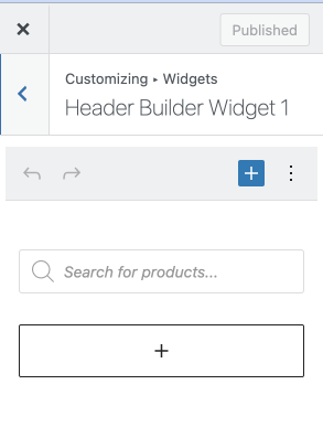
That’s it! You’ve successfully edited the default header and added our custom block.
Another possible case is that you want to put our search bar anywhere within a blog post or a single page. To do so, from your dashboard → select a post or page you want to add the bar to → within the post, add the new block → pick the FiboSearch block
Here’s the simplified process:
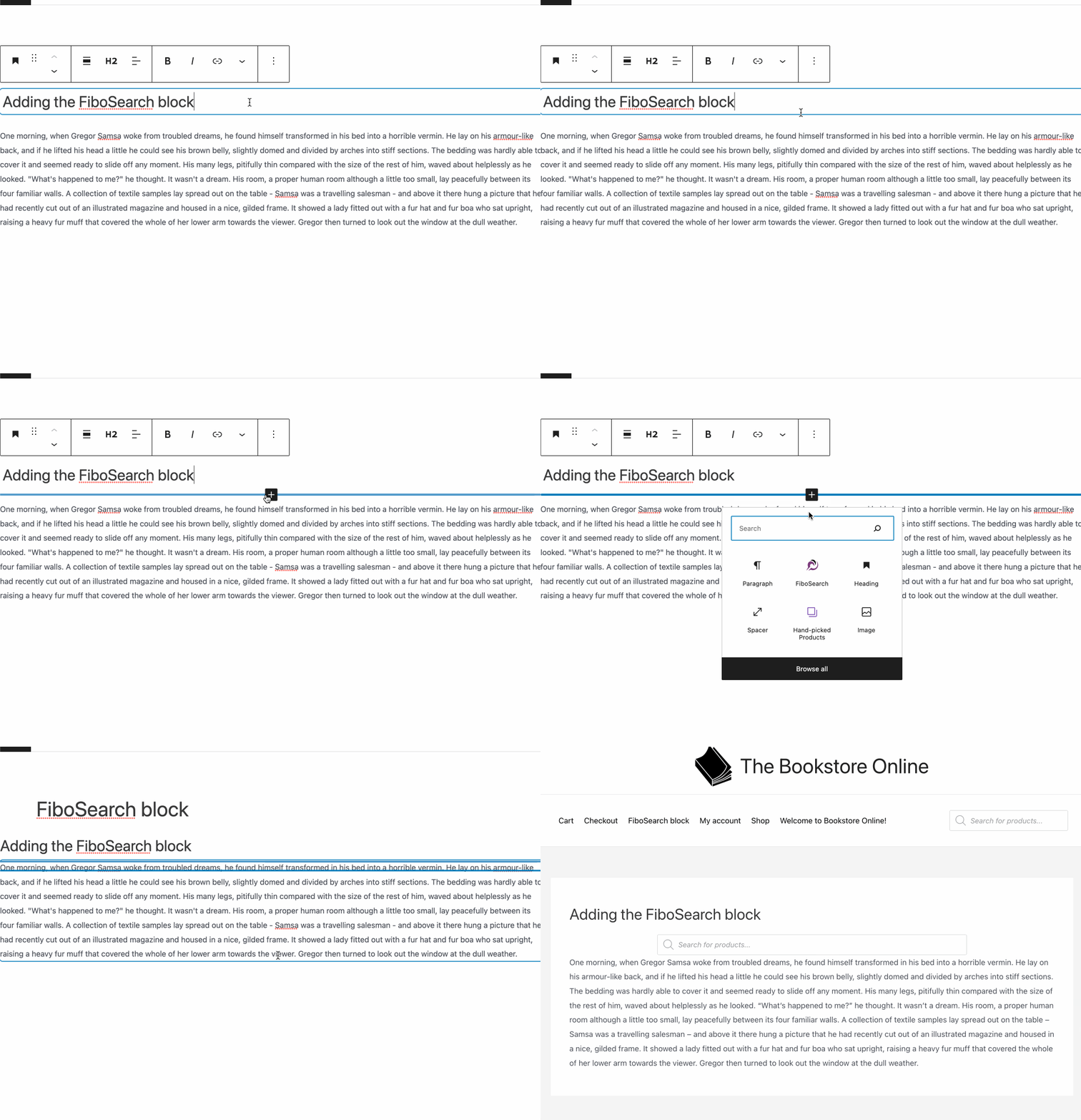
Please use either method when you want to have more control over the layout and search bar placement on your site.
FSE – standard „FiboSearch” block
With FSE, things are even a little bit easier than with the Block Editor. First of all, you actually see what you’re doing in real time, without frustrating surprises after checking your frontend. Second, the block-based workflow matured to become the foundation of a whole page building process. Now, it’s not only the content within a post that can be created using blocks — it’s the whole page, instead.
Notice: in this section we’re using the standard “FiboSearch” block, the same as previously mentioned in the Block Editor section. For information on using the navigation-specific “FiboSearch Navigation Item” block, please skip to the next section.

This design was built entirely using Full Site Editing. How did we achieve that? We wanted the header to consist of our mock-up store’s branding (logo, name and motto), then on the second line of navigation and FiboSearch search bar. Once again, from the dashboard select “Editor” → from the templates section at the top of the screen select “Page” – this way the header and other elements will be used on every single page
To remind you of the overall look and feel of FSE:

As you can see, all templates already added to the site are listed on the left. FSE makes great use of blocks that help you align your content horizontally and vertically, such as groups and rows. The internal structure of a header will often look like this:
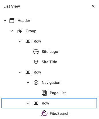
To achieve results similar to The Bookstore Online header, we used two separate “Group” blocks, divided it into separate “Row” blocks and simply added the content. Adding the FiboSearch block to the right of the lower part of the header is analogous to adding any other block.
FSE – the “FiboSearch Navigation Item” block
Most of our users want to embed the search bar within the navigation and not just somewhere inside the header. The “FiboSearch Navigation Item” block is aimed specifically at using it as an item inside the “Navigation” WordPress block. While the structure described in the section above, specific for the Block Editor, might work just fine, it has one major limitation: if a breakpoint is met, ultimately the navigation and the search bar will be divided into two lines or one row will cramp another.
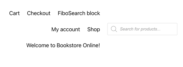
With the “FiboSearch Navigation Item” block we’re offering a solution to that. Please let us reconsider the header structure:

With the first layout built with the Block Editor, inside the “Row” you will see blocks like “Navigation” and “FiboSearch”, respectively. When customers enter a store with this kind of structure, it might be the case that the combination of their device and browser will effectively present those blocks as separate objects. The results might look like this and are far from ideal (refer to Figure 2 above).
Now, to fully unlock the potential of the “FiboSearch Navigation Item” block, we’ll build a simplified row structure. Inside the “Row” you will see an embedded row with the site’s credentials blocks “Site logo” and “Site title” and the whole “Navigation” block.
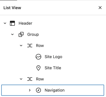
And the internal “Navigation” block’s structure:

FiboSearch search bar will then replace the standard “Search” block with the use of a custom “FiboSearch Navigation Item” block.
The default “Navigation” block’s look is a plain, full search bar:

It’s also the typical WordPress search bar with a subpar engine that we want to replace with FiboSearch. More so, we want the design to be really clean and simple. To achieve this, we’ll hide the search bar behind a “magnifying glass” icon.
The final look:

In the Full Site Editing, first you’ll need to select the “Search” block → the most convenient way to do so is to choose it from the List view to the left → once selected, click the small “magnifying glass” icon in the block’s panel → change the selection to the “FiboSearch Navigation Item”
A GIF to help you out with the whole process:

As with any other method of adding our search bar to your site, there are plenty of stylistic options to choose from. To edit them, please select the “FiboSearch Navigation Item” block from the List view → go to the “Settings” panel in the FSE → select a suitable style from the list
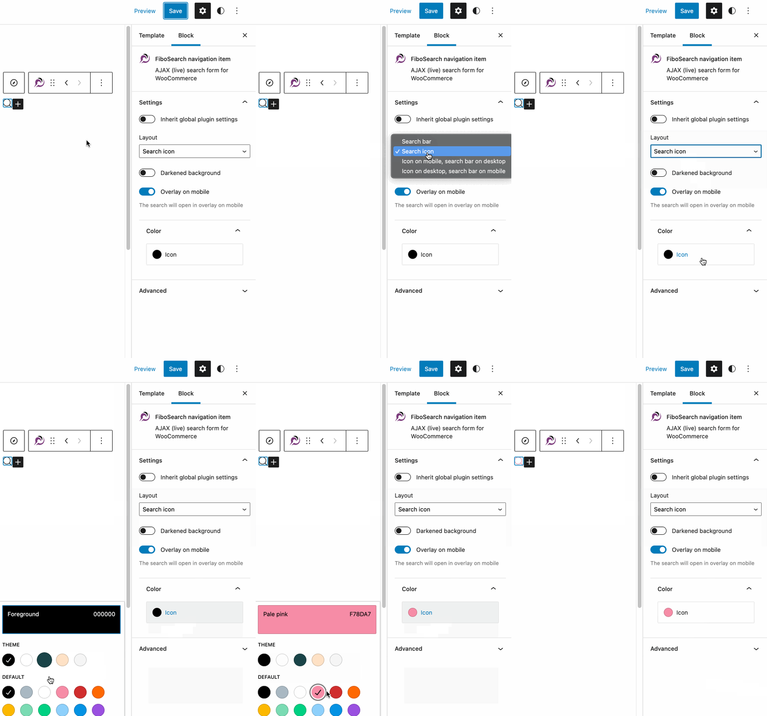
You can pick from four different styles:
- Search bar
- Search icon
- Search icon on mobile, search bar on desktop
- Search bar on mobile, search icon on desktop
Additionally, you can change the icon’s color and use our custom features. Please click the links and read more on Darkened background and Overlay on Mobile features of FiboSearch.
FiboSearch shortcode update
For those of you who’ve used a [fibosearch] “shortcode” block to embed our search bar anywhere on your sites – you can now transform those blocks directly into “FiboSearch” block with just two clicks. To do so, open any page where you’ve used the “Shortcode” block → click on the “Shortcode'' block → click the [/] icon in the top-left of the “Shortcode” block’s panel → select “FiboSearch” from the dropdown menu named “Transform to”

The main benefit of transforming “Shortcode” blocks is that with the dedicated “FiboSearch” block you see the block as it is inside the Block Editor of Full Site Editing. As presented on the GIF above, after the transformation you see a proper search bar instead of a more abstract version – previously the “Shortcode” block switches visually into a search bar only on the front end or in the “Preview” mode of the editor.
Recap
We hope that adding our custom block will be a welcomed addition to FiboSearch. FSE is definitely here to stay and will be developed by the WP team in the years to come. This doesn’t mean that block-based themes will fall to the wayside. In our opinion, the adoption of FSE is a gauntlet thrown in the direction of third party builders like Elementor. As plugins, and not core WP features, they are yet another possible cause of problems. What’s more, most of the builders are hidden behind a paywall and have got more and more pricey during the last few years.
A few things to remember about Block Editor, Full Site Editing and, of course, FiboSearch block:
- The Block Editor allows users to customize the inside of posts and pages
- Full Site Editing further develops the idea of block-based themes, allowing users to build their sites from already familiar blocks, as well as adding content just like they would with block-based themes
- FiboSearch introduces two separate blocks: a standard “FiboSearch” block and navigation-specific “FiboSearch Navigation Item” block
- FiboSearch might be implemented:
- In the Block Editor as an element of a header, footer or other section in the “Customisation” section
- In the Block Editor as a block within a post or page
- In the FSE as a part of a template, like single page, single post, header, footer, etc.
- In the FSE as a block within a post or page
- In the FSE within the“Navigation” block, using a custom “FiboSearch Navigation Item” block
- A [fibosearch] shortcode can now be transformed into a “FiboSearch” block and give you an instant visual presentation of the block inside both the BE and FSE
As always, we’re looking forward to hearing back from you. Any feedback will be much appreciated — your opinions and insight are what drives all major and minor changes to our plugin.
Kind regards,
FiboSearch Team
