Using an overlay on mobile devices is beneficial in few different ways:
- Better search experience
- More streamlined UX
- Easy to find suggestions and results
- Minimalistic layout compliant with many modern designs
What do we mean by an overlay? Let’s have a look at examples:
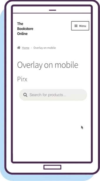
Pirx layout (a default one in FiboSearch)
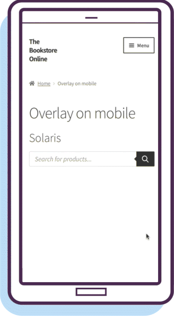
Solaris layout (alternative)
Overlay triggered by just an icon (alternative)
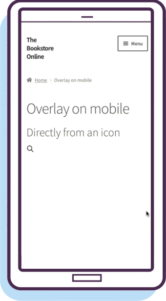
As you can see, an overlay appears after a customer taps the input box to type a query. The input box then jumps to the upper edge of the screen and the whole screen changes into a field to present search results.
Hence the name: “overlay” means covering anything that was already displayed on the screen and simplifying the view to input box + results. This helps avoid distraction and steer customers from anything but the results.
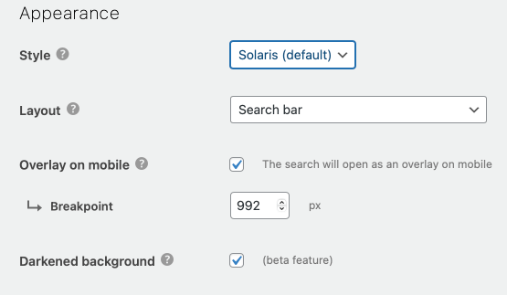
How to activate?
To activate this feature, go to WooCommerce → FiboSearch → Search bar and scroll down to the “Appearance” section.
- To activate the overlay, select the “Overlay on mobile” checkbox
- Additionally, you can set a custom breakpoint – this lets you display the overlay only on devices smaller than X (
992pxin our case)
Using shortcodes
You can also activate the overlay feature via shortcodes. By doing so, that search bar will overwrite the global settings on your site and will appear as an overlay design on mobile devices.
[fibosearch mobile_overlay="1" ]– forces overlay on mobile[fibosearch mobile_overlay="1" mobile_overlay_breakpoint="768" ]– forces overlay on mobile + breakpoint fixed at768px