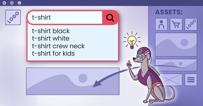
The best search UX you can offer – learn how to design your store around the search bar and turn visitors into customers
 Max 16min read
 When entering any shop, customers simply want to achieve one goal: find the right product. As with every challenge, different strategies can be undertaken. Fortunately, it’s primarily down to you to pave the way towards finding products – and you can help your customers in many ways. We assume that you must be at least familiar with the two most popular ways of finding products, that is using either search or navigation. Regardless of which strategy you’ve decided to use in your store, these are ubiquitous and you come across them anytime you shop online. Moreover, these strategies are often used alongside each other, which we’ll cover towards the end of this article. Our main focus will be on using and implementing the search strategy, although we will meticulously study navigation as it’s the most popular alternative.
Table of Contents
- How do you want your customers to find the right products – an overview
- Best practices for using search as the main product-finding strategy
- Making the search bar UX-friendly and prominent
- Positioning – desktop
- Positioning – mobile
- Using contrast – desktop
- Using contrast – mobile
- Sizing – desktop
- Sizing – mobile
- Using padding and margins – desktop
- Using padding and margins – mobile
- Using distinct borders – desktop
- Using distinct borders – mobile
- Summary – complete desktop and mobile examples
- Properly designed suggestions
- Keep the suggestions scope narrow
- Avoid scrollbars
- Highlight suggestions as well as the original query
- Highlight active suggestion
- Keep the suggestions box plain and simple
- Design the suggestions panel to be distinctive
- Reduce visual noise that can interfere with the suggestions panel
- Provide enough padding and space for suggestions
- Considerations
- Recap
How do you want your customers to find the right products – an overview
To give some visual background, let’s look at both strategies as examples. We’ve opted for stores that deliberately use one approach over the other, just for clarity and a more stark comparison. Notice: we’ll use the term strategy instead of approach while describing search and navigation – we see the product finding process as crucial and, well, strategic, so this better suits our needs for this article.
Using search:
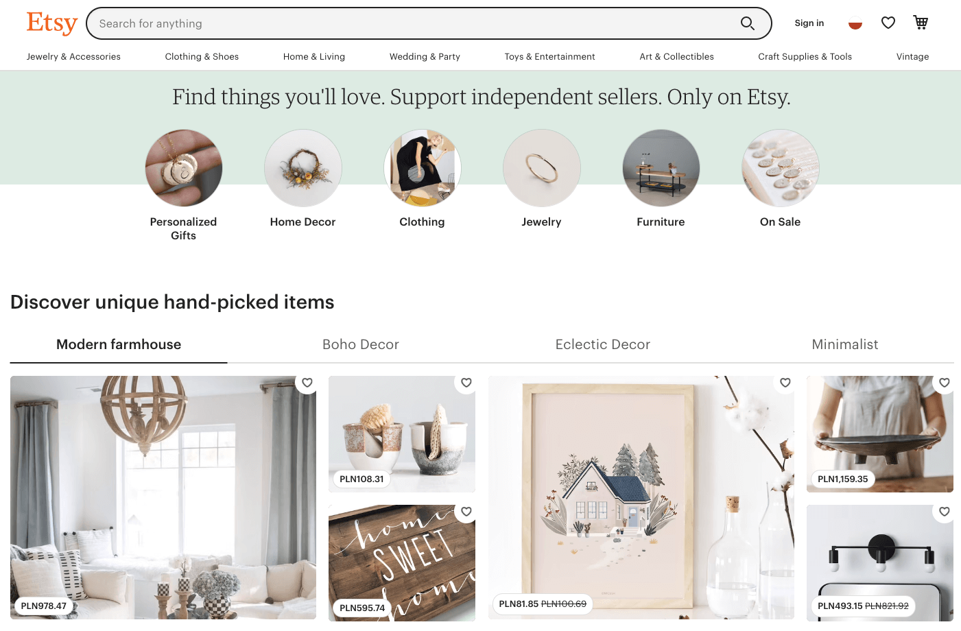
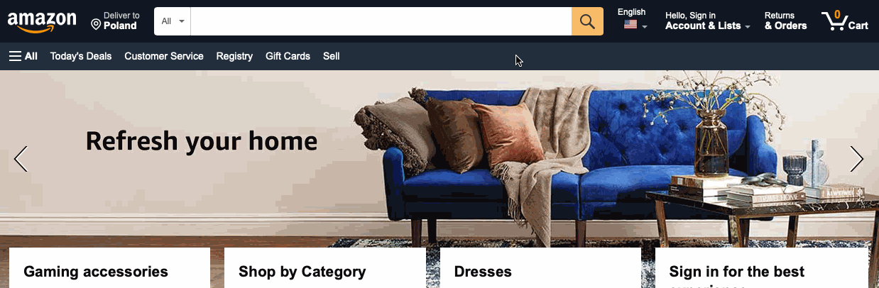
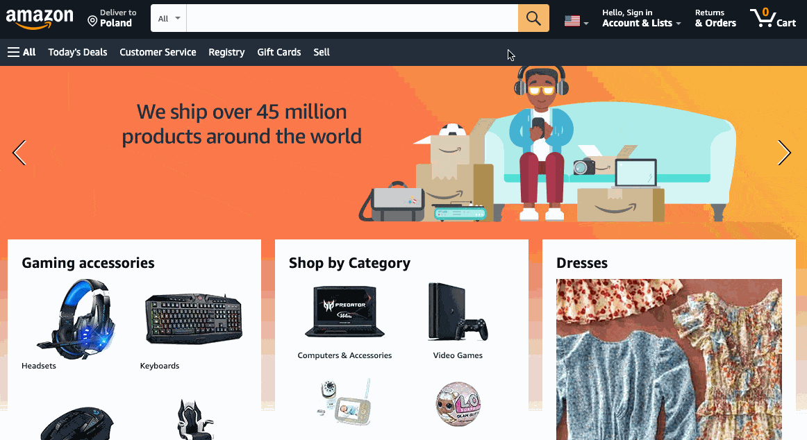
This strategy is used by companies with massive catalogs and different products divided into lots of categories, like huge retailers, online wholesalers and marketplaces. Other famous examples are Amazon or IKEA.
Etsy’s design team’s message is clear: customers, please search for products using a search bar, purposefully placed in the top-center part of the screen. We’ll dig into that in further sections.
Using navigation:

This strategy is universally used by companies and brands where visual impressions matter the most, like fashion, eyewear, home decor. Other examples include Zalando or Ray Ban.
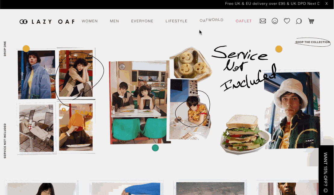
In the example from Figure 2, Lazy Oaf (a fashion brand based in London) wants you to dive into the categories or dig deeper into specific branches presented on banners. This strategy more resembles typical window shopping than actually searching for the right product. On Lazy Oaf’s page there is, actually, an optional search bar, but it’s hidden under an icon and really small – enough to discourage most people from even bothering to find it.
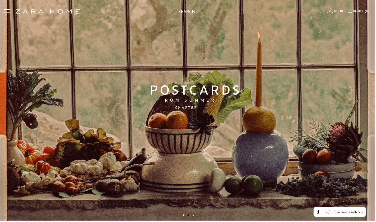
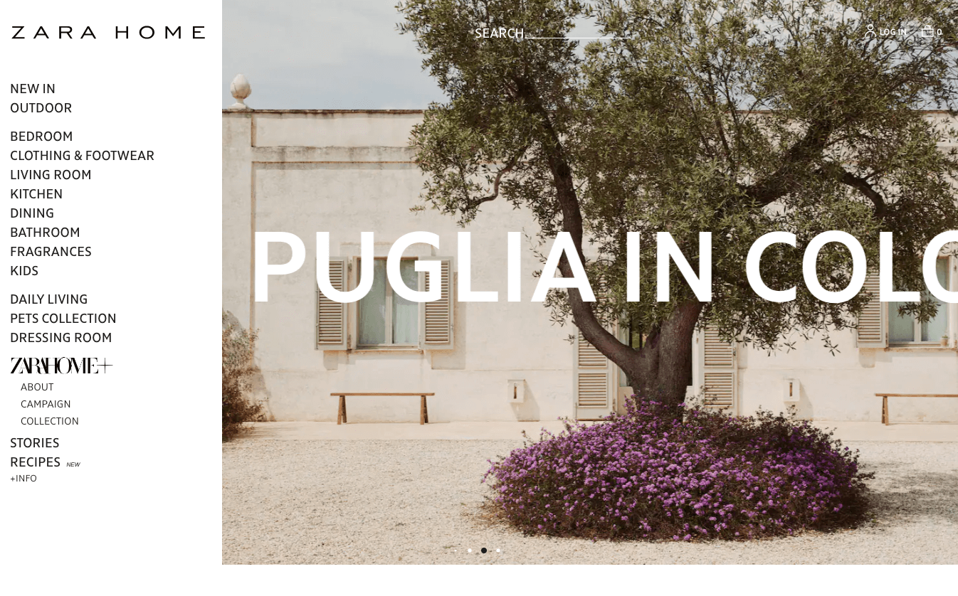
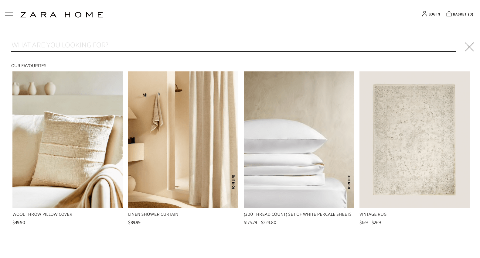
Of course, there are stores and companies that opt for a mix of both strategies. Sometimes it’s a deliberate design approach. We think that Zara Home’s designers team did a lot of research to offer customers the best of both worlds. Just after the loading has finished, customers can pick from a well-placed search bar and a hamburger menu, which intuitively suggests a navigation search. Then, surprisingly, both strategies are designed with UX in mind, so both will do the job and help find the right products. The navigation pop-up, sliding from the left (Figure 4), is sleek and helps you get your head around the general categories to narrow the search scope down. On the other hand, the search bar pops up with a neatly designed overlay design, ready to collect customer queries. The most popular (or for recurring customers – recently viewed) product tiles are a nice addition to this impressively designed search experience.
However, sometimes a mix of both strategies is just a sloppy, half-way attempt to satisfy all demands. In our opinion, Urban Outfitters didn’t do so great, resulting in a cluttered and chaotic main page (Figure 6).

As you can see, picking the right strategy is very business-specific. If you’re wondering which might be more beneficial for you or you’re about to redesign your store, it’s definitely worth a consideration. Let’s discuss the pros and cons of those strategies and then move towards a detailed description of using search – with the right implementation of FiboSearch features.
Navigation
As presented on Figure 2, navigation encourages customers to manually browse the store. It usually uses a mix of a category tree, to initially select interesting products, and filters. The results are a few pages out of typically thousands available, presenting products that might actually be interesting for a particular customer. Let’s check out an example:
We wanted to find some bright, funny looking men’s trousers, so we headed to a broad Men category → Trousers → here we scrolled until we’ve found the right pair – Big Furry Pants
This is widely used in visually-sensitive branches, where sellers want to present customers a broad selection of products to choose from, accompanied by pictures, GIFs or 360” viewports.
Search and autosuggestions
By “search” we understand a strategy that uses any kind of physical or (more and more frequently adopted) voice input to collect customer queries and present them with a relevant results page. The most typical and recognizable approach is with a search bar, and, ideally, autosuggestions. Here’s an example:
Using this strategy, customers input a query, which is analyzed and the search engine suggests the most relevant products.
In our case, we knew that we wanted to buy pink trousers → we typed the query in → the engine provided us with the most relevant autosuggestions.
What’s more, a standard submit button or (hitting the enter/return key) is universally assigned to trigger a search results page. In Amazon’s case, either method you pick is fine – the submit button in this case is a magnifying glass in the yellow box. The results page itself consists of more refined versions of the suggestions presented prior in the drop down from the search bar (like on Figure 7).
Please remember that it’s considered good practice to leave the original query typed in the search bar even after the customers have already been presented the results page. It’s a common search strategy: a customer types a query → hits the submit button → reviews the results → redefines the query. This process helps your customers and your conversions alike.
Let’s see a few examples:
We’ll now solely focus on the search strategy, leaving navigation for another piece. We want to describe the best practices and help you tweak your store’s layout and performance to best suit your clients.
Best practices for using search as the main product-finding strategy
At this point you may ask yourself: which strategy is the most suitable for my business? We’ve come up with a short FAQ to help you figure it out. If you have answered YES to three or more of these questions, using search will be definitely beneficial for you!
- Do you have a big catalog of products?
- Do your customers tend to type precise queries on your site?
- Do you want to implement voice search in your store?
- Do you want to use auto suggestions and help customers tweak their queries?
- Do you want to offer personalized search suggestions?
- Do you want to present additional product data based on the search query?
- Do you prefer a sleek design, without navigation panels or tiles, that better suits the design of your store?
Once you’ve figured out if search is a good strategy for you, let’s begin with some basics. For a particular search experience to be pleasurable and efficient actually depends on few key factors:
- A fast engine with auto suggestions that works well
- Good search bar design
- Proper search bar positioning
- Autosuggestions divided and highlighted
- Search query staying intact after hitting the submit button
With FiboSearch, some of these are checked right out of the box, especially the search engine speed and auto suggestions kicking in within less than 0.2 sec. Some of the features, however, have to be set up or tweaked to hit that sweet UX spot.
Making the search bar UX-friendly and prominent
Let’s tackle the problems one by one and solve them as we progress. We decided to break every section to desktop and mobile parts to clearly draw the main differences.
Positioning – desktop
The search experience is almost unequivocally associated with using a search bar. Its positioning is probably the most crucial factor that has to be triple-checked.
There is no use for even the most sophisticated engine if the customers cannot find it.
A well-positioned search bar is:
- Readily available – avoid hiding it under an icon or, worse, in a drop-down menu of any sort
- Visible – top-right or top-center positions work best and are the most familiar for most of the customers
From the examples it’s clearly visible that the biggest hitters in retail opt for the top-center position. All of those stores also offer distinguishable submit buttons – some more minimalistic and some brighter and stronger.


Positioning – mobile
On mobile, positioning done right is almost universally a top-center search box. This is crucial to give your customers the opportunity to use the box. Remember not to hide the bar under a drop down, an icon or any other element.
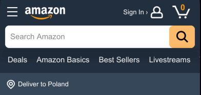
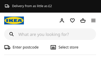
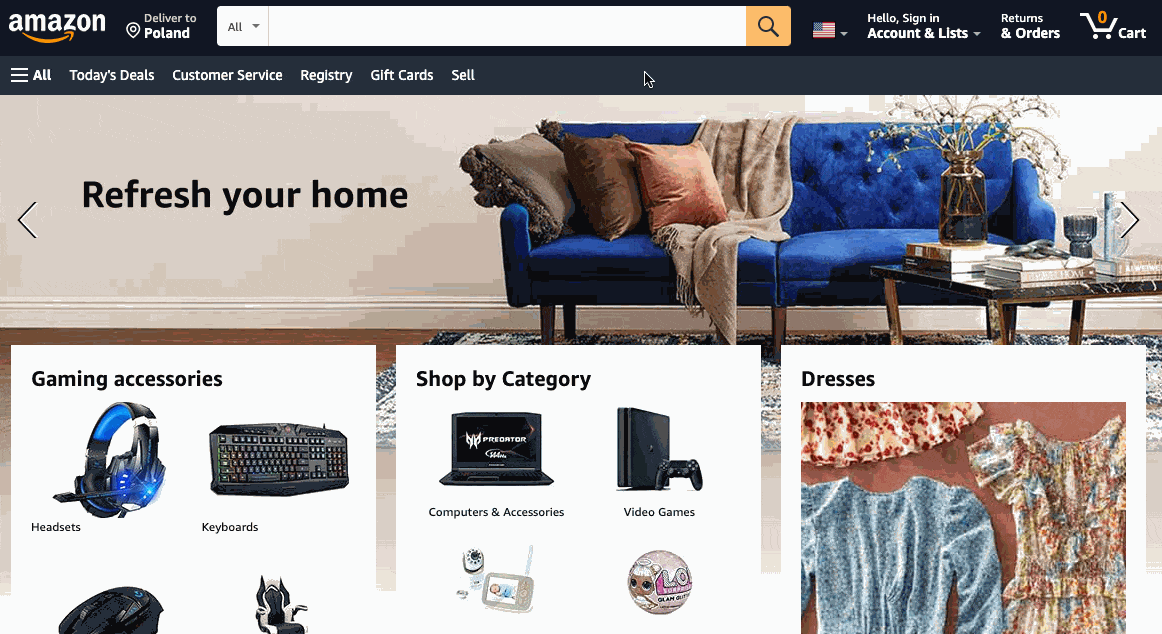
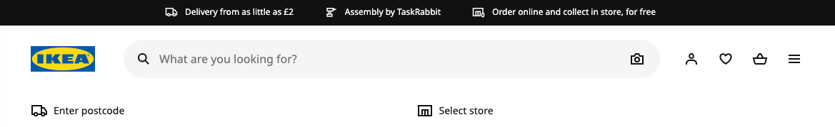
Those two examples are on top of their game. Clear, simple, visually distinctive, Amazon using a stark contrast, while Ikea opted for a distinction by shape. Both bars also offer a distinguishable submit button – once again, using completely different approaches. However, the code is clear: use the magnifying glass icon to search for the desired products.
With FiboSearch, there are five different strategies to add a search bar to your site. Assuming you’d like to give it a try and place your search bar similarly in the top-center (or anywhere else, for that matter), use one of those:
- Replace the theme’s search bar with FiboSearch
- Add FiboSearch to the menu
- Add FiboSearch with a shortcode
- Add FiboSearch as a widget
- Add FiboSearch to a PHP file
- Add FiboSearch as a block “FiboSearch” in the Block editor and Full Site Editing
- Add FiboSearch as a block “FiboSearch Navigation Item” in Full Site Editing “Navigation”
Read how to add the search bar in our documentation. For those of you already familiar with shortcodes, please refer directly to this article. For detailed information about both FiboSearch blocks, please relate refer to this article.
Using contrast – desktop
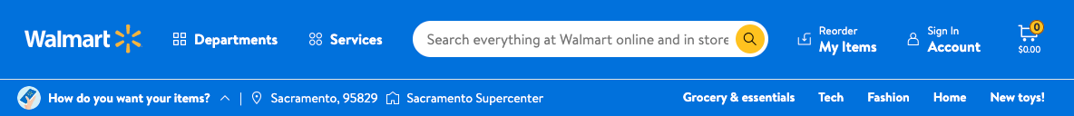
As presented above, on Figures 8 and 9, using clear contrast can help find the search bar from the get go. Customers don’t have to think about the search strategy as it is “served” directly. Walmart and Amazon put great emphasis on their search bars and encourage customers to use them throughout their experience with the store.
Walmart is so confident with their search bar positioning and design that they don’t use any additional features to distinguish the suggestions panel once the customer has typed the query:
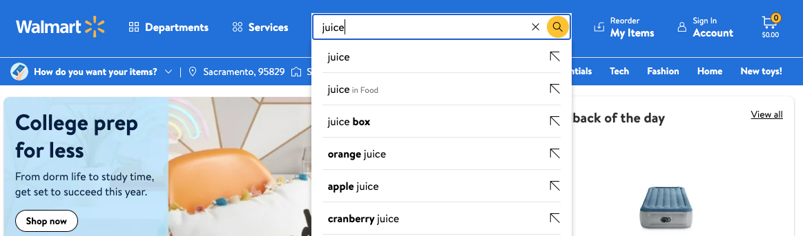
However, they do use cleverly designed auto suggestions highlighting – skip here for more information.
On the other hand, Amazon uses a more conservative approach with a darkened background around the panel:
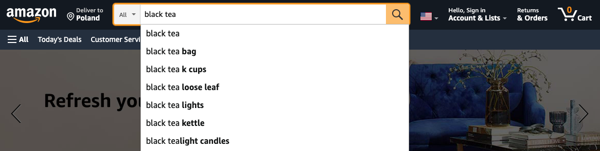
We’ll get into details about this and other applicable features in this section.
Using contrast – mobile
Generally speaking, using contrast is fairly similar on both desktop and mobile.
As you can see, Amazon’s and Walmart’s mobile search bars are similar to their desktop counterparts. However, once again, Amazon did a slightly better job – as you can see, its placeholder ideally fits within the bar’s borders while you can’t say the same about Walmart’s bar. We’ll discuss the importance of that in the padding and margins section.
The FiboSearch search bar is highly customizable. To achieve different stylistic results, you can:
- Change the search bar colors
- Change the search bar width
- Change the color of the search bar edges
- Set the search bar background color
- Show/hide the submit button
- Set your own label for the submit button
- Change the placeholder color
- Show/hide the magnifier icon
- Change any element with CSS
- Show/Hide a darkened background
- Adjust the appearance of live suggestions
- Set suggestion colors
- Show/hide a product image
- Show/hide a product price
- Show/hide a product SKU
- Set your own “See more products” label
- and much more
The most direct changes will include search bar color, edges, submit button, placeholder color and magnifier icon. Please refer to our documentation to make any changes that will suit your design and improve your search bar’s visibility.
Notice: FiboSearch comes in two different styles. Consider which one will suit you best from the beginning and start the changes from there. Our default one, Solaris, is more utilitarian, squarish and familiar:

The other, Pirx, is softer and comes with a more curvy look.

Both designs work great on both desktop and mobile. We wanted to make it more convenient for you to have more styles to choose from and to tweak them further.
Sizing – desktop
In most cases, positioning the search bar in the top-center (like in most of our examples) results in a big bar playing a central role in the whole page’s design. Most bars are relatively short, typically to accommodate +3 – +4 points of text more than the placeholder’s text. In most cases, the search bars stretch to take at least 50% of the whole screen width.

As with borders and margins, designers for desktop are given much more freedom to accompany the bars with other elements, most typically logos, banners, buttons, login panels, etc. We’ll see that on mobile things start to get difficult.
Sizing – mobile
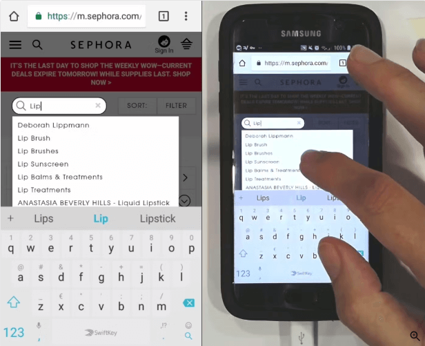
Sizing on mobile generally follows one rule – stretching the search bar to the full width of the screen. Due to the limited size of the screen, it’s the only sound solution to offer a big, clear and easy to use search bar. Let’s see some examples:
Some brands, like Etsy or Walmart, use a smaller search bar on the initial screen, which turns into an overlay with a fully stretched search bar when customers click on it:
By comparison with their desktop counterparts, it’s clear that mobile is less forgiving. Layouts are much simpler with any extra features reduced. A rule of thumb is to use the hamburger menu to get rid of any unwanted elements that otherwise will take precious space on the customers’ screens.
To make changes to the FiboSearch search bar, you’d want to adjust its width. Please refer to the documentation for detailed information.
Using padding and margins – desktop
These properties are less important on desktops and most often some mishaps are less substantial. Due to big screens, and even on modern laptops, thanks to their huge resolution, you have plenty of space and your customers won’t struggle with disappearing placeholders or elements “jumping” one on another. Make sure that the elements are positioned properly and test your site on a range of different screens to make sure that all popular screen sizes are covered.
Using padding and margins – mobile
Padding on mobile is more sensitive and should be well scrutinized. Search bars are relatively smaller and the screen can get crowded easily – a wrong mix of margins and padding will result in overlapping elements, missing parts of text or difficulties in finding the search bar. Let’s see an example of a search bar well optimized for mobile use:
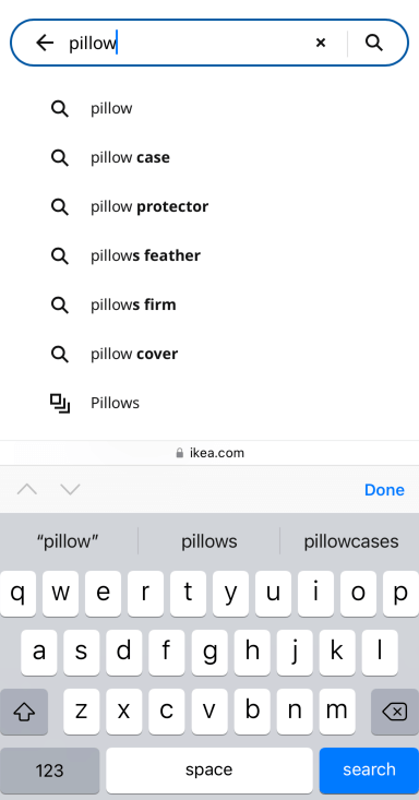
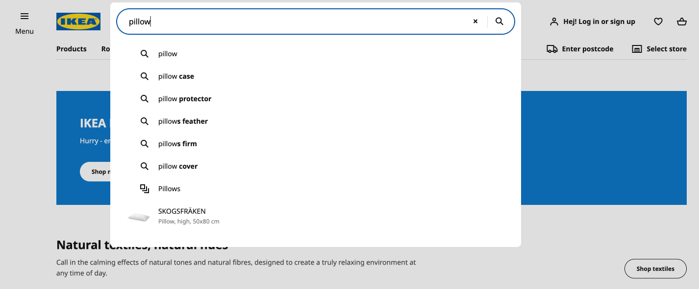
Ikea has ticked all the boxes. The search is prominent, the placeholder text is present in full, the submit button is there. After customers start typing their queries, the navigation icons are immediately present – you know that “x” will clear the query, the “left arrow” will bring back the main screen and the “magnifying glass” will get you the results page. Also, the designers thought about a maximum number of suggestions and narrowed the scope so that customers can view a limited amount of suggestions on their screens. We’ll get into details on using properly designed suggestions in a second – you can also jump right to this section.
We want to show some examples that don’t quite get it right this time.
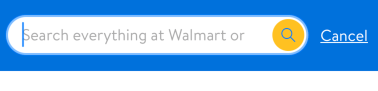
Walmart should’ve gone with a solution similar to Ikea’s – put all navigation buttons into the box, ditch the “cancel” and maybe redefine the placeholder text. Right now, for the customers to be able to read the placeholder text they have to turn their devices to the horizontal position. They did better on the results page:
The navigation resembles that of Ikea. The only small caveat is that the suggestions don’t have a narrowed scope and customers will have to scroll them down. A good practice is to avoid such scrollbars, and we’ll cover that in a second.
Using distinct borders – desktop
Some stores and marketplaces prefer to go with a bar that uses the same color as the surroundings (or a rather restricted color scheme). To complement such design with good UX, a common approach is to use distinct borders around the bar.
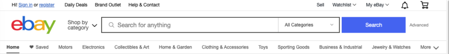
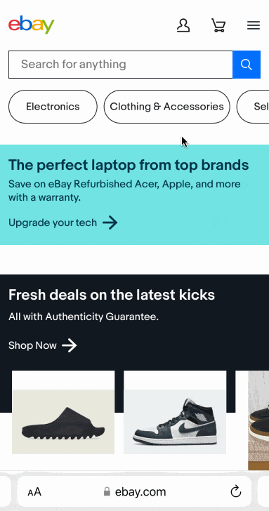
Ebay designed the whole page white, although their search bar is definitely easy to find:

Ebay’s used the same approach as Walmart did – suggestions are not accompanied by any other visual features, like shading or darkening the background.

Applying distinct borders to your search bar should be a no-brainer. If you’ve designed your store with a minimalistic or only few hues of one color, it’s one of the most efficient and effective ways to make the bar prominent and UX-friendly.
Using distinct borders – mobile
Similar to using contrast, desktop and mobile follow the same principles. Mobile versions of stores that decided to use distinctive borders are analogous both on mobile and desktop.
Once again, to make changes directly to the search bar’s styling, please refer to this article.
Summary – complete desktop and mobile examples
Try as we might, we’ve found only one great example among the most popular online retailers. As you might’ve expected by now, it’s Ikea. Let’s see it one more time:
Ikea’s top-center search bar on desktop:
Ikea’s top-center search bar on mobile:
They did everything right:
- Great positioning
- Clearly visible search bar with great navigation
- Nice usage of features like overlay and darkening the background
- Narrow scope of suggestions
- Suggestions properly categorized and highlighted
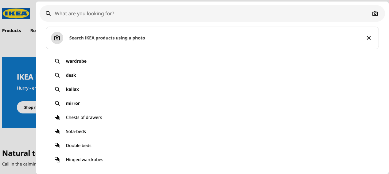
- On top of that – the possibility to search using your photos
Moreover, they put the same effort into desktop and mobile. No matter how you want to shop IKEA online, you can be sure they’ve got you covered. It’s a great example of a proper, balanced search UX that everyone can learn from.
Properly designed suggestions
As we’ve mentioned, a mere search bar is not enough to suit your customers. With the ubiquity of auto suggestions in almost every modern e-commerce, it’s important to implement them in your store. To put this into perspective, let’s compare those two approaches:
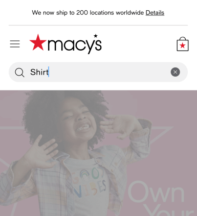
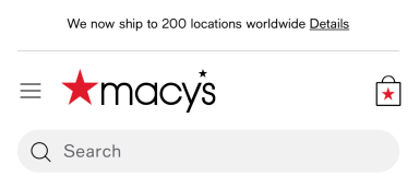
Ikea (Figure 10) puts extra effort to offer users the most useful suggestions. Moreover, they didn’t forget to highlight the searched query and leave it in the search bar – big kudos! On the other hand, Macy’s (Figure 11) site lets customers type the query and then… nothing happens. It’s only after customers hit the return/enter/submit button that the search results page is presented. This is unfortunately in line with Baymard’s research which shows Read a full article about how to properly design your suggestions
“(…) that search autocomplete is provided on 80% of e-commerce sites (a decrease from 96% in 2019, but more than the 72% we benchmarked in 2014)” and “(…)only 19% of sites get all the implementation details right for the autocomplete feature”.
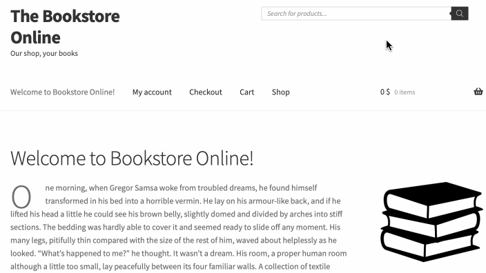
Let’s talk ‘do’s and don’ts’ to improve suggestions on your site. We’ll make use of good and poor examples from the biggest retailers and our own mockup store, The Bookstore Online, to present you how flawlessly suggestions work with FiboSearch.
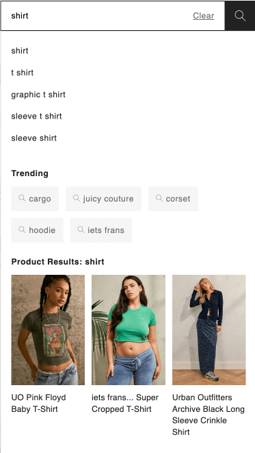
Keep the suggestions scope narrow
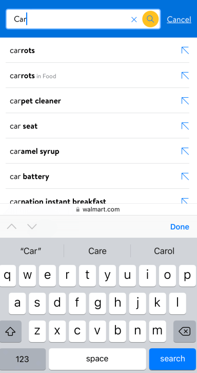
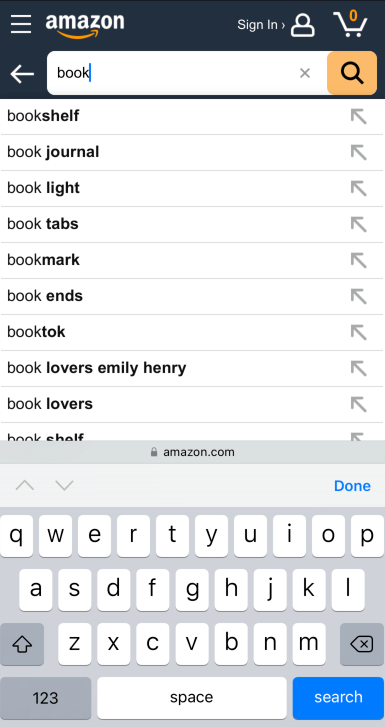
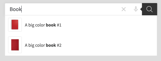
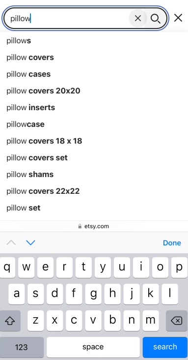
When a customer searches for a product, you can possibly offer him an unlimited number of auto suggestions. However, this will lead to a very long list, which will likely create issues. On desktop it can easily cause a cognitive load, ending with customers losing interest or leaving your store altogether. On mobile, the suggestions list will be “longer” than the provided part of the screen – customers will have to resort to scrolling. Let’s see this with some examples:
Avoid scrollbars
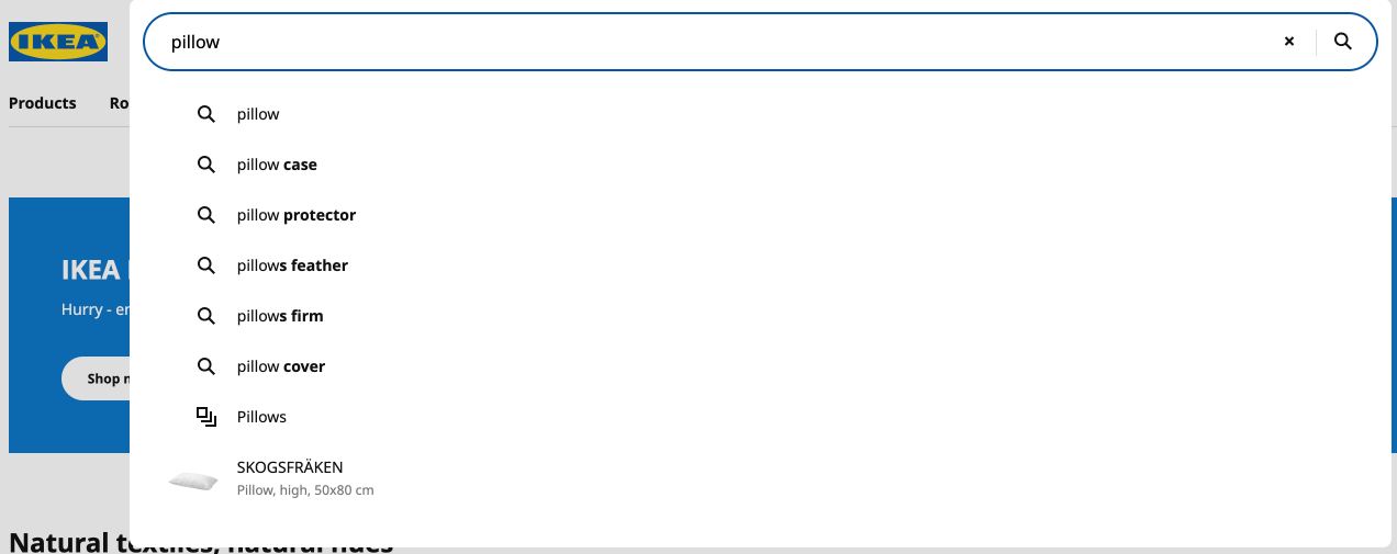
This issue was partially covered in the last point. It’s especially crucial for mobile devices. If users have to scroll through the suggestions panel, they can accidentally pick the suggestion they are not interested in, get misguided or frustrated. It’s a good practice to present a maximum of 4-5 relevant suggestions and keep them on one screen, avoiding any need for scrolling. Ikea is, once again, a very good example:
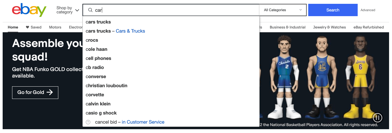
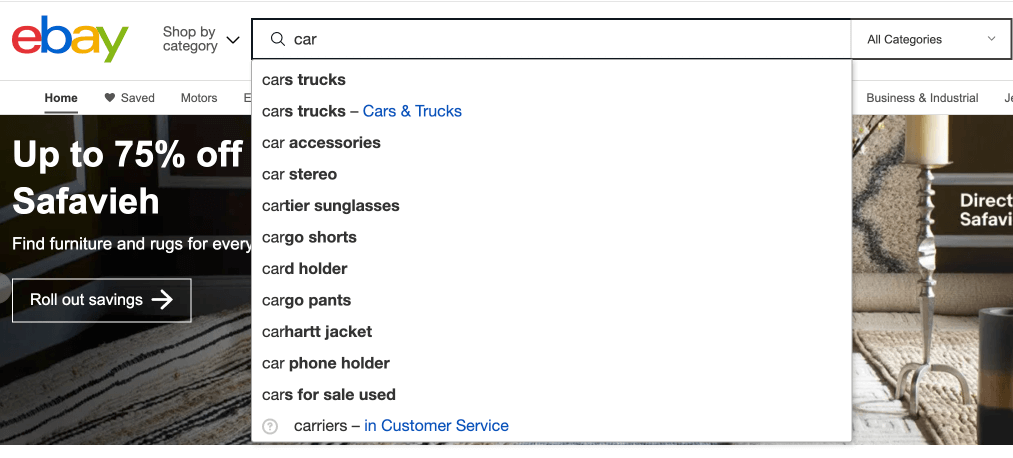
On the other hand, eBay offers too many positions, forcing users to scroll:
Highlight suggestions as well as the original query
When the customers type the query, it’s important that suggestions actually highlight some portion of the text. There are two main strategies for that.
Highlighting the typed query – this is by default the FiboSearch setting; what customers have typed is then highlighted if the engine finds a suitable suggestion (Figure 12 and 13)

Highlighting the predictive portion – only the suggested text or its fragments are highlighted (Figure 15 and 16)
With FiboSearch we opted for suggesting products rather than offering a simple suggestions list. This way you can present a relevant list of products with additional data that might be relevant for your customers.
Highlight active suggestion
It’s important, specifically on desktop, that users know which suggestion they are about to click. Most shops use, by default, a “hand” cursor on mouse hover, however in most cases it’s not sufficient. To fix this, just remember to highlight the query that the customer’s mouse hovers over. Additionally, add a subtle background shading for this suggestion.
Fortunately, FiboSearch has got you covered. By default, the hovered over element gets the background shape + the cursor switches to “hand”. The last selected item stays highlighted even after the cursor is removed from the search bar, until a customer clicks elsewhere or hits the submit button to trigger the results page.
Keep the suggestions box plain and simple
Even a nice and minimalistic design can get crowded easily. When customers type their queries, an additional panel with suggestions pops up. It’s worth remembering that every additional detail around the panel plus the information within the panel itself can be distracting for customers. That’s why you shouldn’t get carried away with the internal design of the suggestions panel. Even Ikea with their smart features inside the box, like searching via photos or suggesting the most suitable product, keeps it simple. Let’s see a few examples:
Almost every other big retailer falls under the same principles. FiboSearch by default also offers a clean, minimalistic approach to suggestions. You can of course tweak this to your liking, using ACFs or other 3rd party solutions, but remember – suggestions are here to help users find the right products, not for you to show off your IT and design skills.
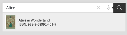
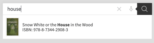
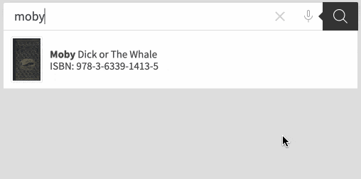
In this example, you can see the additional ISBN number that is displayed thanks to an integration between FiboSearch and ACF. Read our post on FiboSearch/ACF integration The integration itself lets customers search by a custom field, although with FiboSearch you actually display this data in the search field. Please, read our detailed tutorial on how to do so in our documentation. This additional information comes very handy for all the bookworms out there and at the same time it doesn’t add to visual noise around the suggestions.

Design the suggestions panel to be distinctive
This corresponds with the paragraphs concerning the overall design of the search bar. You should make your suggestions panel distinctive and easily recognizable for the customers. When they just click on the box, it’s best to darken the background. The suggestions panel will also be presented against this background, resulting in an overall prominent design.
FiboSearch, of course, lets you darken the background as one of its features. To learn how to do so, please
refer to this article.
Read our post on how to implement the darkened background feature
An example from our The Bookstore Online:
Some good examples are IKEA or Amazon, as you’ve seen in plenty of images and GIFs above. However, some big hitters often get it wrong, resulting in a suggestions panel that is somehow bland and hard to read:
On mobile things are a little bit easier, as the panel often takes over the whole screen. Most often the search bar is a trigger for a big overlay, in which the suggestions are presented. Etsy is one example:
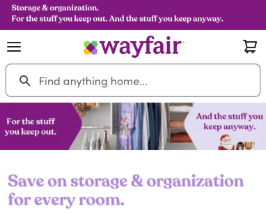
Other stores, like Wayfair, present a small part of the original page under or around the search bar and suggestions panel:
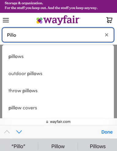
Reduce visual noise that can interfere with the suggestions panel
It’s also important to limit potential elements that can interfere with the suggestions panel. Think pop ups, banners, chatbot icons, promo actions, etc. They can cause chaos and steer customers away from using suggestions. Once more, it’s ever so important on mobile devices. Of course we’ve added a feature to FiboSearch that will help reduce the visual noise. We called it “overlay on mobile” and you can read about it in our documentation.
Let’s see some examples:
An extreme level of overcrowded design. An app download encouraging banner, a promo code, a huge cookies panel and a minimal space to even type the query. It is possible that this was purposefully crafted to push customers towards downloading the app, but many of them will probably just pick another vendor.
The suggestions are actually there, but the overall design is spoiled with banners, icons and a huge header. It’ll be also better for the UX to present suggestions as a list and leave that kind of view for a results page. Moreover, the highlighting is quite off – it took us more than a minute to figure out that the same color is used for the “sale” banner and to highlight the searched text.
Provide enough padding and space for suggestions
This point is especially important for mobile. A poorly designed suggestions panel will result in a compressed results list which will cause problems for customers. Most common mistakes are: a font that is too small and not enough space between suggestions on the list. Customers will have trouble hitting the right suggestion, will mis-tap or mis-type something on the keyboard while actually trying to hit the suggestion.
If you remember to narrow the scope to no more than 5 records on the list, it will be a lot easier to provide a big enough font, padding for the whole panel and enough space between records.
Walmart and IKEA are both well designed examples:
A really poorer result:
One example from the experts at Baymard:
Considerations
Offering consistent search experience throughout your site
It’s safe to assume that your customers will visit more than one page on your site. Hopefully, they’ll follow the whole customer journey up to the payment section and will finalize the buying process.
Hence, it’s very important to offer the same search UX throughout the whole shopping process. What do we understand by that? Remember to:
- Position the search bar in the same place – if you’re using the top-center position, don’t change it once customer is visiting another page, for example search results
- Use the same fonts in the search bar, for placeholder text, input and suggestions alike
- Do not minimize the search bar once the customers are visiting another page
- Offer a submit button near the search bar
- Do not make any changes to the submit button, such as changing its color, sizing, positioning relative to the search bar
- On mobile – if you’re using a sticky header, make sure that the search bar is the same size anytime a user wants to type the query
Keeping a consistent design will help your clients as they will readily know where to put their queries and how to interact with the search engine. This familiarity is very welcomed by the customers and is definitely considered good practice.
Using search alongside navigation
While designing your store it’s crucial to pick the best product finding strategy and offer it to your customers. But picking the right one, first, is a really grueling task and, second, it doesn’t mean that you have to ditch navigation in favor of using search (or the other way around). What’s more, even stores which predominantly use search as their core strategy can also include some navigation elements to help clients. It’s just some of them prefer that way, are more accustomed to it or simply appreciate the freedom of choice. In fact, many big retailers use both strategies, to various extents. In this article we relied heavily on examples from huge retailers like Amazon, IKEA, Etsy, etc. as those who picked mainly the search-oriented strategy. But it doesn’t mean that you cannot navigate those stores! On images throughout the article you could’ve, actually, see such implementations. Let’s analyze them and pinpoint navigation-oriented elements in these services:
It’s worth noticing that all those stores heavily rely on search bars and promote search as their main product finding strategy. You can tell this by the positioning, contrast and overall prominence of search bars on the sites. All navigation-oriented elements are smaller, not highlighted, positioned to the corners on desktop or below the search bar on mobile.
If you plan to implement some of these elements on your site, it’s always great to look at the examples from those big retailers, take notes and carefully blend them into your design.
Recap
We hope that this article will help you when designing or redesigning your store. If search is the primary search strategy that you’re offering to your customers, it’s best to offer them outstanding UX. Here are the most important points to achieve that:
- Apply a fast and reliable search engine
- Apply auto suggestions
- Position your search bar at the top-center or top-right
- Don’t hide the bar under a drop down, icon, etc.
- Don’t delete the query once customers review the search results page
- Use overlay and darkened background features to distinct the suggestions panel from its surroundings
- Style your search bar:
- Use contrasting colors to distinguish the search bar from the surroundings
- Use a good amount of padding – especially for the mobile version; it has to accommodate both the bar and the autosuggestions
- Use distinct borders when you’re using a restricted color scheme
- Size the bar properly – especially for the mobile version; consider the typical size of your customers’ devices and the fact that to produce the query, the screen will often has to accommodate the content and the keyboard
- Allow navigating the bar vertically using arrows
- Use a distinct and recognisable submit button (a magnifying glass icon, a button with text like “go”, “search”, etc.)
- Design your suggestions properly
- Use highlighting
- Consider the internal suggestions structure – should the focus be on the category or the searched keyword?
- Match the number of suggestions to the device – ~10 for desktop and less than 5 for mobiles
- Avoid scrollbars
- Declutter the whole suggestions panel
Kind regards,
FiboSearch Team