FiboSearch allows you to choose from four search bar layouts.
Table of Contents
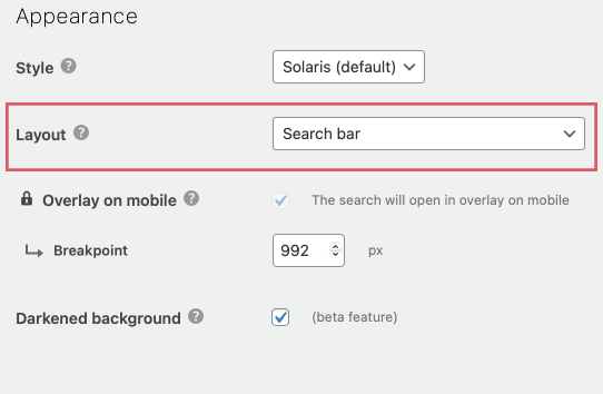
To select a layout for your search bar, navigate to WooCommerce → FiboSearch → Search bar in your dashboard. Scroll down to the Appearance section and select the layout:

Layouts
There are four distinctive layouts at your disposal:
- Search bar
- Search icon
- Search icon on mobile, search bar on desktop
- Search bar on mobile, search icon on desktop
Every layout comes in two distinctive styles – Solaris, our default style, and our latest one: Pirx.
Functionalities are 100% the same for both styles so we’ll only present them in the Solaris style.
Layout 1 — Search bar
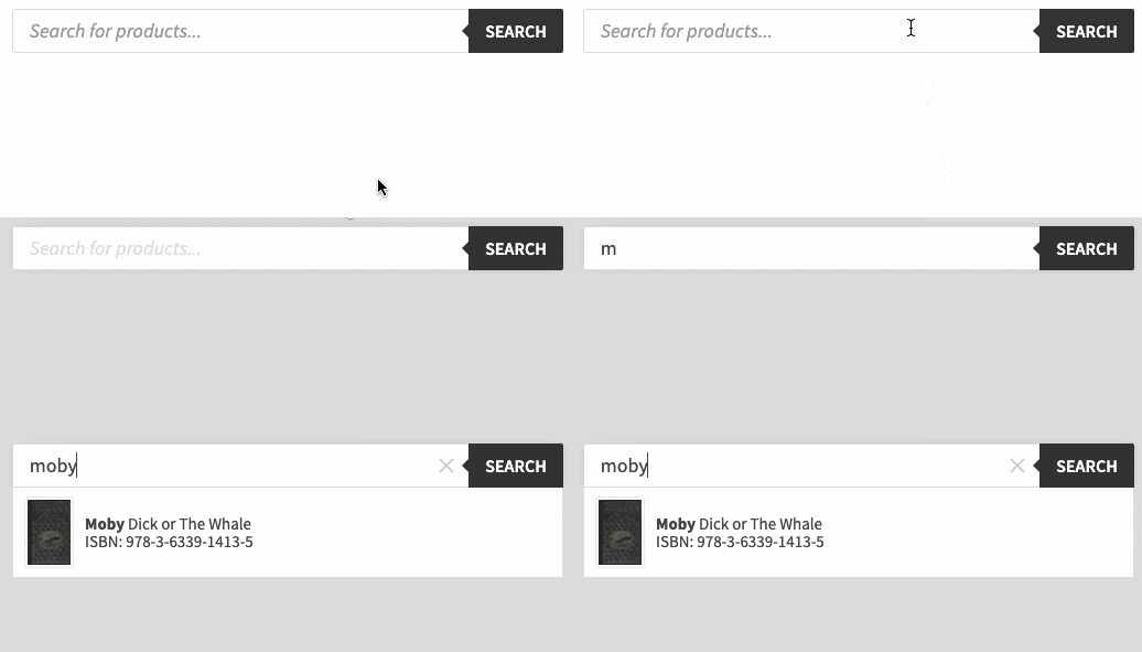
The most common and ubiquitous design, resembling the default WooCommerce search bar.

Layout 2 — Search icon
A plain magnifying glass icon, a popular search bar symbol.

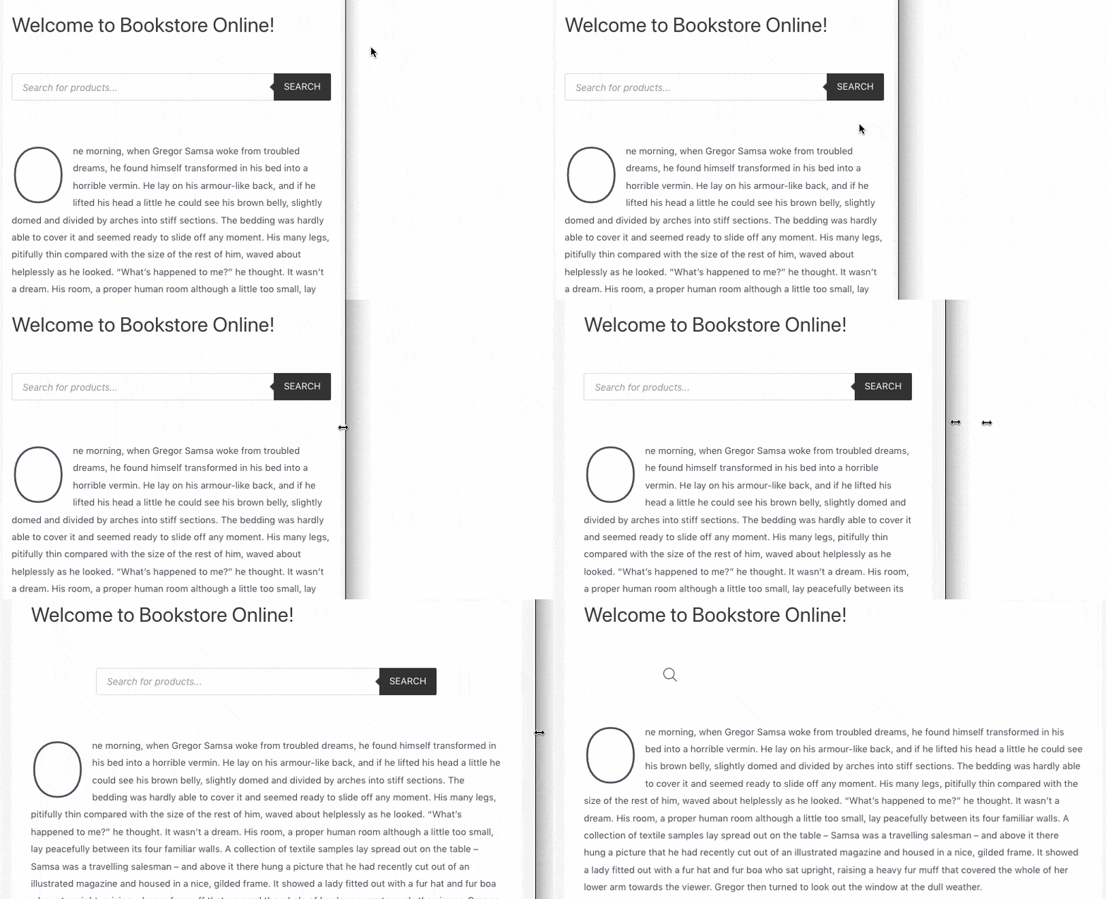
Layout 3 — Icon on mobile, search bar on desktop
As described above, the search bar appears when users browse your shop on the desktop and then automatically switches to an icon at a custom set breakpoint.

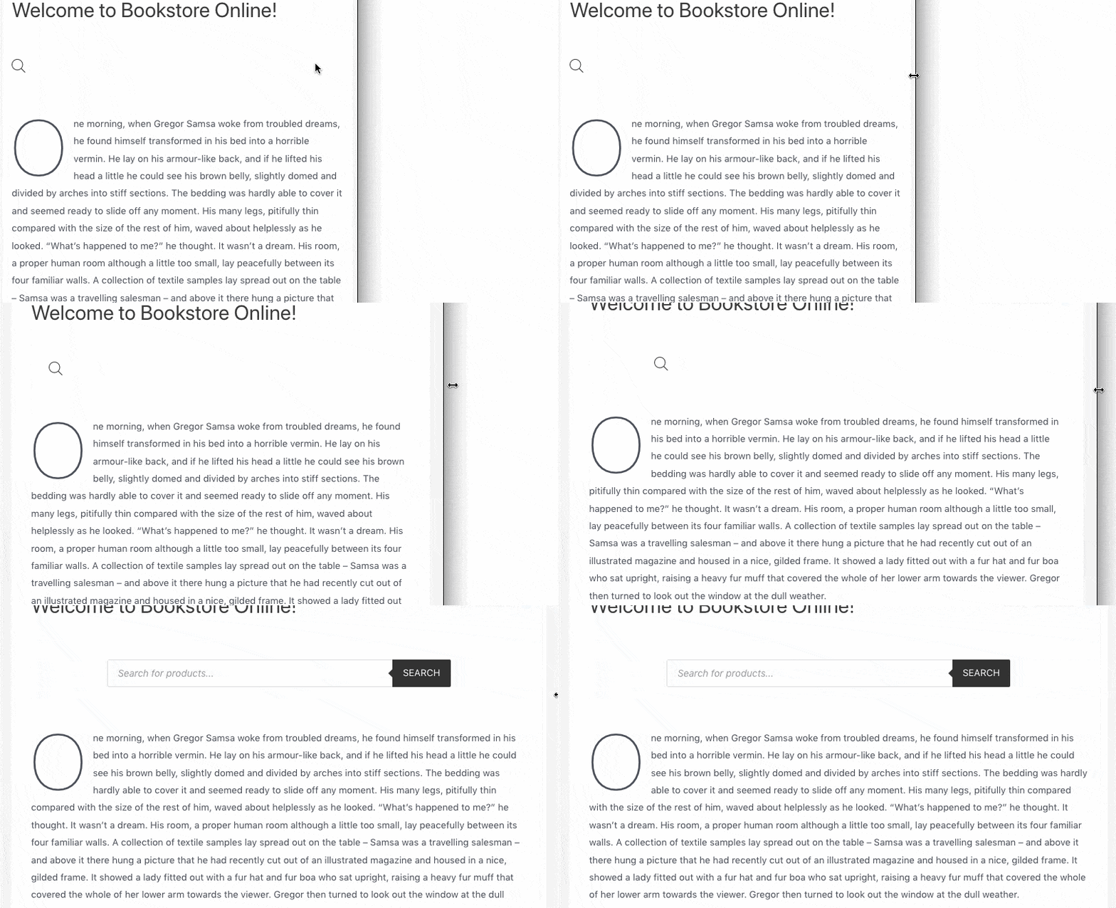
Layout 4 — Icon on desktop, search bar on mobile
Inversely, the icon appears on the desktop and the search bar on the mobile version of the browser.

Layout as a shortcode parameter
You can also embed a specific layout on your site using shortcodes.
This list corresponds directly to the layouts described in the first section of this article:
[fibosearch layout="search-bar"]
[fibosearch layout="icon" ]
[fibosearch layout="flex-icon-on-mobile"]
[fibosearch layout="flex-icon-on-desktop"]
Moreover, you can set up precise breakpoints within shortcodes – this way the search bar will switch to an icon (or vice versa) when a specified width is met.
[fibosearch layout="flex-icon-on-mobile" layout_breakpoint="800" ]
[fibosearch layout="flex-icon-on-desktop" layout_breakpoint="800" ]